Table of Contents
29. Module ImGui
This Plugin is a wrapper over Dear ImGui and has some modification to be able to use it in Lua as external module/plugin for this engine.
It is widely used to build editor such as sprite maker shader editor , etc…
Important
Dear ImGui is immediate GUI! so it is based on loop. Then, basically, you have to control what should be render inside the main loop of the engine otherwise will not be render.
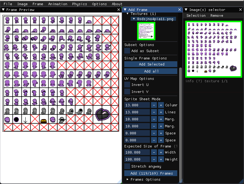
Figure 29.1 Sprite maker running.
29.1. Begin / End methods
29.1.1. Begin / End
Window
Begin() = push window to the stack and start appending to it.
End() = pop window from the stack.
You may append multiple times to the same window during the same frame.
Passing
booleancloseable astrueshows a window-closing widget in the upper-right corner of the window, which clicking will result the second booleanclosed_clickedastrue.Begin() return
falseto indicate the window is collapsed or fully clipped.
You may early out and omit submitting anything to the window checking this flag.
Always call a matching End() for each Begin() call, regardless of its return value!
Important
Due to legacy reason, this is inconsistent with most other functions such as BeginPopup/EndPopup, etc. where the EndXXX call should only be called if the corresponding BeginXXX function returned true. Begin() and BeginChild() are the only odd ones out. Will be fixed in a future update!
Note that the bottom of window stack always contains a window called “Debug”.
- Begin(title, closeable, flags)
- Parameters
string – title
boolean – closeable might be closed?
number – flags
- Returns
boolean,boolean- is_opened, closed_clicked
- End
End a Window
Example:
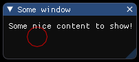
tImGui         =  require "ImGui"

function onLoop(delta)
    local title     = 'Hello ImGui Plugin'
    local closeable =  true
    local flags     =  0

    local is_opened, closed_clicked = tImGui.Begin(title, closeable, flags)
    print(is_opened, closed_clicked)
    if is_opened then
        tImGui.Text('Some nice content to show!')
    end
    tImGui.End()
end
29.1.2. BeginPopupModal
- BeginPopupModal(title, closeable, flags)
Modal dialog (regular window with title bar, block interactions behind the modal window, can’t close the modal window by clicking outside)
- Parameters
string – title
boolean – closeable might be closed?
number – flags
- Returns
boolean,boolean- is_opened, closed_clicked
- EndPopup
Only call EndPopup() if BeginPopupXXX() returns true!
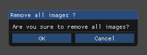
Example:
tImGui         =  require "ImGui"
open_modal     = true
function onLoop(delta)
    if open_modal then
        local flags       = tImGui.Flags('ImGuiWindowFlags_AlwaysAutoResize')
        local title_popup = 'Remove all images ?'
        tImGui.OpenPopup(title_popup);
        local is_opened, closed_clicked = tImGui.BeginPopupModal(title_popup, false, flags)
        if is_opened then
            tImGui.Text('Are vou sure to remove all images?')
            tImGui.Separator();
            if tImGui.Button("OK", {x=120, y= 0}) then
                tImGui.CloseCurrentPopup()
                open_modal = false
            end
            tImGui.SetItemDefaultFocus();
            tImGui.SameLine();
            if tImGui.Button("Cancel", {x=120, y= 0}) then
                tImGui.CloseCurrentPopup()
                open_modal = false
            end
            tImGui.EndPopup()
        end
    end
end
29.1.3. BeginChild
Child Windows
Use child windows to begin into a self-contained independent scrolling/clipping regions within a host window. Child windows can embed their own child.
For each independent axis of ‘size’: ==0.0f: use remaining host window size / >0.0f: fixed size / <0.0f: use remaining window size minus abs(size) / Each axis can use a different mode, e.g. ImVec2(0,400).
BeginChild() returns false to indicate the window is collapsed or fully clipped, so you may early out and omit submitting anything to the window.
Always call a matching EndChild() for each BeginChild() call, regardless of its return value [as with Begin: this is due to legacy reason and inconsistent with most BeginXXX functions apart from the regular Begin() which behaves like BeginChild().]
- BeginChild(str_id, size, border, flags)
- Parameters
string – str_id (might be
nil)table – size default:
{ x = 0, y = 0}boolean – border
number – flags
- Returns
boolean- result
- EndChild
End Child.
Example:
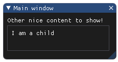
tImGui          =  require "ImGui"

function onLoop(delta)
    local title     = 'Main window'
    local closeable =  true
    local flags     =  0

    local is_opened, closed_clicked = tImGui.Begin(title, closeable, flags)
    if is_opened then
        tImGui.Text('Other nice content to show!')

        local str_id  =  '01'
        local size    =  {x = 200, y = 50}
        local border  =  true

        tImGui.BeginChild(str_id, size, border, flags)
        tImGui.Text('I am a child')
        tImGui.EndChild()
    end
    tImGui.End()
end
29.1.4. BeginMenu
- BeginMenu(label, enabled)
Create a sub-menu entry. only call EndMenu() if this returns true!
- Parameters
string – label
boolean – enabled
- Returns
boolean- result
- EndMenu
Only call EndMenu() if BeginMenu() returns true!
Example:
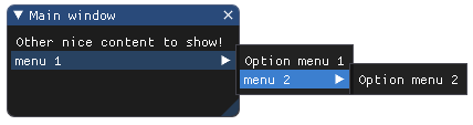
tImGui          =  require "ImGui"
local title     = 'Main window'
local closeable =  true
local flags     =  0

function onLoop(delta)
    local is_opened, closed_clicked = tImGui.Begin(title, closeable, flags)
    if is_opened then
        tImGui.Text('Other nice content to show!')

        local label    = 'menu 1'
        local label2   = 'menu 2'
        local enabled  =  true

        if tImGui.BeginMenu(label, enabled) then
            tImGui.Text('Option menu 1')
            if tImGui.BeginMenu(label2, enabled) then
                tImGui.Text('Option menu 2')
                tImGui.EndMenu()
            end
            tImGui.EndMenu()
        end
    end
    tImGui.End()
end
29.1.5. BeginPopupContextVoid
- BeginPopupContextVoid(str_id, flags)
Helper to open and begin popup when clicked in void (where there are no ImGui windows).
- Parameters
string – str_id (might be
nil)number – flags - e.g.
ImGuiPopupFlags_MouseButtonRight(default). Use Flags() for combined flags.
- Returns
boolean- result
Example:
tImGui              =  require "ImGui"
local str_id        =  'id_1'
local flags         =  tImGui.Flags('ImGuiPopupFlags_MouseButtonRight')  -- right-click
function onLoop(delta)
    if tImGui.BeginPopupContextVoid(str_id, flags) then
        if tImGui.Selectable("Some option") then
            print('You have chosen this option')
        end
        tImGui.EndPopup()
    end
end
29.1.6. BeginPopupContextWindow
- BeginPopupContextWindow(str_id, flags)
Helper to open and begin popup when clicked on current window.
- Parameters
string – str_id (might be
nil)number – flags - e.g.
ImGuiPopupFlags_MouseButtonRight(default). Use Flags() for combined flags.
- Returns
boolean- result
Example:
tImGui                 =  require "ImGui"
local str_id           =  '01'
local flags            =  tImGui.Flags('ImGuiPopupFlags_MouseButtonRight')
function onLoop(delta)
    if tImGui.BeginPopupContextWindow(str_id, flags) then
        if tImGui.Selectable("Some option") then
            print('You have chosen this option')
        end
        tImGui.EndPopup()
    end
end
29.1.7. BeginPopupContextItem
- BeginPopupContextItem(str_id, flags)
Helper to open and begin popup when clicked on last item. if you can pass a
nilstr_id only if the previous item had an id. If you want to use that on a non-interactive item such as Text() you need to pass in an explicit ID here.- Parameters
string – str_id (might be
nil)number – flags - e.g.
ImGuiPopupFlags_MouseButtonRight(default). Use Flags() for combined flags.
- Returns
boolean- result
Example:
tImGui              =  require "ImGui"
local str_id        =  '01'
local flags         =  tImGui.Flags('ImGuiPopupFlags_MouseButtonRight')
function onLoop(delta)
    if tImGui.BeginPopupContextItem(str_id, flags) then
        if tImGui.Selectable("Some option") then
            print('You have chosen this option')
        end
        tImGui.EndPopup()
    end
end
29.1.8. BeginPopup
- BeginPopup(str_id, flags)
Return true if the popup is open, and you can start outputting to it. only call EndPopup() if BeginPopup() returns true!
- Parameters
string – str_id (might be
nil)number – flags
- Returns
boolean- result
- EndPopup
Only call EndPopup() if BeginPopupXXX() returns true!
Example:
tImGui        =  require "ImGui"
function onLoop(delta)
    local str_id  =  '01'
    local flags   =  0
    if tImGui.BeginPopup(str_id, flags) then
        tImGui.EndPopup()
    end
end
29.1.9. BeginMainMenuBar
- BeginMainMenuBar
Create and append to a full screen menu-bar.
- Returns
boolean- result
- EndMainMenuBar
Only call EndMainMenuBar() if BeginMainMenuBar() returns true!
Example:
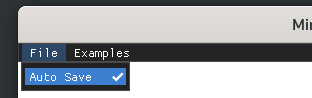
tImGui        =  require "ImGui"
bAutoSave     = false
bOtherMenuBar = false

function onLoop(delta)
    -- Main Menu Bar
    if (tImGui.BeginMainMenuBar()) then

        if tImGui.BeginMenu("File") then

            local pressed,checked = tImGui.MenuItem("Auto Save ", nil, bAutoSave)
            if pressed then
                bAutoSave = checked
            end
            tImGui.EndMenu();
        end
        if tImGui.BeginMenu("Examples") then

            local pressed,checked = tImGui.MenuItem("Other menu bar", nil, bOtherMenuBar)
            if pressed then
                bOtherMenuBar = checked
            end
            tImGui.EndMenu()
        end
        tImGui.EndMainMenuBar()
    end
end
29.1.10. BeginTooltip
- BeginTooltip
Begin/append a tooltip window. to create full-featured tooltip (with any kind of items).
- EndTooltip
End Tooltip
Example:
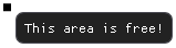
tImGui  =  require "ImGui"
function onLoop(delta)
    tImGui.BeginTooltip()
    tImGui.Text('This area is free!')
    tImGui.EndTooltip()
end
29.1.11. BeginTabBar
- BeginTabBar(str_id, flags)
Create and append into a TabBar
- Parameters
string – str_id (might be
nil)number – flags
- Returns
boolean- result
- EndTabBar
Only call EndTabBar() if BeginTabBar() returns true!
Example:
tImGui        =  require "ImGui"
function onLoop(delta)
    local flags   =  tImGui.Flags('ImGuiTabBarFlags_Reorderable')
    if tImGui.BeginTabBar('##TabBar_id', flags) then
        if tImGui.BeginTabItem("Tab 1") then
            tImGui.Text('Hello')
            tImGui.EndTabItem()
        end
        if tImGui.BeginTabItem("Tab 2") then
            tImGui.Text('Tab')
            tImGui.EndTabItem()
        end
        tImGui.EndTabBar()
    end
end
Note
BeginDragDropSource/EndDragDropSource are not exposed in this Lua wrapper.
29.1.12. BeginGroup
- BeginGroup
Lock horizontal starting position
- EndGroup
Unlock horizontal starting position + capture the whole group bounding box into one “item” (so you can use IsItemHovered() or layout primitives such as SameLine() on whole group, etc.)
Example:
tImGui  =  require "ImGui"
function onLoop(delta)
    tImGui.BeginGroup()
    tImGui.EndGroup()
end
Note
BeginChildFrame/EndChildFrame were removed in ImGui 1.92. Use BeginChild with styling instead.
29.1.13. BeginTabItem
- BeginTabItem(label, p_open, flags)
Create a Tab. Returns true if the Tab is selected.
- Parameters
string – label
boolean – p_open (might be
nil)number – flags (
ImGuiTabItemFlags_SetSelected,ImGuiTabItemFlags_UnsavedDocument, etc…)
- Returns
boolean- result
- EndTabItem
Only call EndTabItem() if BeginTabItem() returns true!
Example:
tImGui        =  require "ImGui"
function onLoop(delta)
    local flags   =  0
    if tImGui.BeginTabBar('##TabBar_id', flags) then
        if tImGui.BeginTabItem("Tab 1") then
            tImGui.Text('Hello')
            tImGui.EndTabItem()
        end
        if tImGui.BeginTabItem("Tab 2") then
            tImGui.Text('Tab')
            tImGui.EndTabItem()
        end
        tImGui.EndTabBar()
    end
end
Note
BeginDragDropTarget/EndDragDropTarget/AcceptDragDropPayload are not exposed in this Lua wrapper.
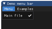
29.1.14. BeginMenuBar
- BeginMenuBar
Append to menu-bar of current window (requires ImGuiWindowFlags_MenuBar flag set on parent window).
- Returns
boolean- result
- EndMenuBar
Only call EndMenuBar() if BeginMenuBar() returns true!
Example:
tImGui  =  require "ImGui"

bMain_file_checked = false
bOtherMenuBar      = false

function onLoop(delta)
    local flags     =  tImGui.Flags('ImGuiWindowFlags_MenuBar')
    local closeable =  true
    local is_opened, closed_clicked = tImGui.Begin('Demo menu bar', closeable, flags)
    if is_opened then
        -- Menu Bar
        if tImGui.BeginMenuBar() then

            if tImGui.BeginMenu("Menu") then

                local pressed,checked = tImGui.MenuItem("Main file ", nil, bMain_file_checked)
                if pressed then
                    bMain_file_checked = checked
                end
                tImGui.EndMenu();
            end
            if tImGui.BeginMenu("Examples") then

                local pressed,checked = tImGui.MenuItem("Other menu bar", nil, bOtherMenuBar)
                if pressed then
                    bOtherMenuBar = checked
                end
                tImGui.EndMenu()
            end
            tImGui.EndMenuBar()
        end
    end
    tImGui.End()
end
29.2. Calc methods
29.2.1. CalcItemWidth
- CalcItemWidth
Width of item given pushed settings and current cursor position. NOT necessarily the width of last item unlike most ‘Item’ functions.
- Returns
number- value
Example:
tImGui  =  require "ImGui"

tImGui.CalcItemWidth()
29.2.2. CalcTextSize
- CalcTextSize(text, text_end, hide_text_after_double_hash, wrap_width)
- Parameters
string – text
string – text_end
boolean – hide_text_after_double_hash
number – wrap_width
- Returns
table- ImVec2{x,y}
Example:
tImGui                             =  require "ImGui"
local text                         =  'some text'
local text_end                     =  'some text'
local hide_text_after_double_hash  =  false
local wrap_width                   =  -1.0

tImGui.CalcTextSize(text, text_end, hide_text_after_double_hash, wrap_width)
Note
CalcListClipping was removed in ImGui 1.92. Use ImGuiListClipper instead.
29.3. Capture methods
29.3.1. CaptureKeyboardFromApp
- CaptureKeyboardFromApp(want_capture_keyboard_value)
Attention: misleading name! manually override io.WantCaptureKeyboard flag next frame (said flag is entirely left for your application to handle). e.g. force capture keyboard when your widget is being hovered. This is equivalent to setting “io.WantCaptureKeyboard = want_capture_keyboard_value”; after the next NewFrame() call.
- Parameters
boolean – want_capture_keyboard_value
Example:
tImGui                             =  require "ImGui"
local want_capture_keyboard_value  =  true

tImGui.CaptureKeyboardFromApp(want_capture_keyboard_value)
29.3.2. CaptureMouseFromApp
- CaptureMouseFromApp(want_capture_mouse_value)
Attention: misleading name! manually override io.WantCaptureMouse flag next frame (said flag is entirely left for your application to handle). This is equivalent to setting “io.WantCaptureMouse = want_capture_mouse_value;” after the next NewFrame() call.
- Parameters
boolean – want_capture_mouse_value
Example:
tImGui                          =  require "ImGui"
local want_capture_mouse_value  =  true

tImGui.CaptureMouseFromApp(want_capture_mouse_value)
29.4. Color methods
29.4.1. ColorConvertHSVtoRGB
- ColorConvertHSVtoRGB(h, s, v, out_r, out_g, out_b)
- Parameters
number – h
number – s
number – v
- Returns
number- red,number- green,number- blue
Example:
tImGui       =  require "ImGui"
local h      = 0.1
local s      = 0.2
local v      = 0.3

local r,g,b = tImGui.ColorConvertHSVtoRGB(h, s, v)
29.4.2. ColorConvertFloat4ToU32
- ColorConvertFloat4ToU32(in)
- Parameters
table – in
{x=0,y=0,z=0,w=0}or{r=0,g=0,b=0,a=0}- Returns
number- ImU32
Example:
tImGui    =  require "ImGui"
local in  = {x=0.66,y=0.5,z=1,z=0.1}

local ret = tImGui.ColorConvertFloat4ToU32(in)
29.4.3. ColorConvertU32ToFloat4
- ColorConvertU32ToFloat4(in)
- Parameters
number – integer
- Returns
table- ImVec4{x,y,z,w}
Example:
tImGui      =  require "ImGui"
local in    = 255

local tVec4 = tImGui.ColorConvertU32ToFloat4(in)
29.4.4. ColorConvertRGBtoHSV
- ColorConvertRGBtoHSV(r, g, b, out_h, out_s, out_v)
- Parameters
number – r
number – g
number – b
- Returns
number- h,number- s,number- v
Example:
tImGui       =  require "ImGui"
local r      = 1.0
local g      = 0.5
local b      = 0.1
local h,s,v  = tImGui.ColorConvertRGBtoHSV(r, g, b)
Note
Columns API was removed in ImGui 1.92. Use Tables API instead.
29.5. CreateContext
Note
You do not need to create a context for this module. It is automatically created by the engine.
29.6. DestroyContext
Note
You do not need to destroy the context for this module. It is automatically destroyed by the engine.
29.7. Flag / Enum
29.7.1. Flags
It is possible to list flag or make flags combining as
string.Enum is considered as Flag.
- Flags(string flag_name_1, string flag_name_2, string flag_name_3, ...)
This method accept variable argument of string as input and make it as unique flag out.
- Parameters
string – flag name - it must be identical to the real name.
- Returns
number- flag combinedORoperation.
Example:
tImGui                             =  require "ImGui"
local ImGuiWindowFlags_MenuBar     = tImGui.Flags('ImGuiWindowFlags_MenuBar')
local ImGuiWindowFlags_NoCollapse  = tImGui.Flags('ImGuiWindowFlags_NoCollapse')
local flag_combined                = tImGui.Flags('ImGuiWindowFlags_MenuBar','ImGuiWindowFlags_NoCollapse')
print('ImGuiWindowFlags_MenuBar',ImGuiWindowFlags_MenuBar)
print('ImGuiWindowFlags_NoCollapse',ImGuiWindowFlags_NoCollapse)
print('flag_combined',flag_combined)
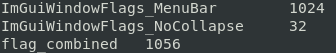
- Flags(table flags)
This method accept a table with array of string as input and make it as unique flag out.
- param table
flags - it must contains array of flags identical to the real name.
- return
number- flag combinedORoperation.
Example:
tImGui                             =  require "ImGui"
local tFlags = {'ImGuiWindowFlags_MenuBar','ImGuiWindowFlags_NoCollapse',}
local flag_combined                = tImGui.Flags(tFlags)
print('flag_combined',flag_combined) -- flag_combined       1056
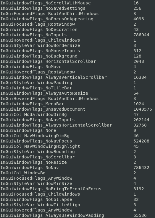
- FlagList(string flag_name_1, string flag_name_2, ...)
List all flags that match the given string(s). Uses partial case-sensitive matching on flag names. Called with no arguments, returns all available flags.
- Parameters
string – filter - partial substring to match (e.g.
'Window'matchesImGuiWindowFlags_*).- Returns
table- flags{key = flag_name, value = number}
Filter prefixes by category (partial match, case-sensitive):
Filter
Matches flags
WindowImGuiWindowFlags_*
PopupImGuiPopupFlags_*
InputTextImGuiInputTextFlags_*
SliderImGuiSliderFlags_*
TreeNodeImGuiTreeNodeFlags_*
SelectableImGuiSelectableFlags_*
ComboImGuiComboFlags_*
TabBarImGuiTabBarFlags_*
TabItemImGuiTabItemFlags_*
TableImGuiTableFlags_*
TableColumnImGuiTableColumnFlags_*
TableRowImGuiTableRowFlags_*
TableBgTargetImGuiTableBgTarget_*
FocusedImGuiFocusedFlags_*
HoveredImGuiHoveredFlags_*
ColorEditImGuiColorEditFlags_*
ItemImGuiItemFlags_*
CondImGuiCond_*
ColImGuiCol_*
StyleVarImGuiStyleVar_*
DrawImDrawFlags_*, ImDrawListFlags_*, ImDrawCornerFlags_*
MouseCursorImGuiMouseCursor_*
MouseButtonImGuiMouseButton_*
KeyImGuiKey_*
DirImGuiDir_*
ConfigImGuiConfigFlags_*
BackendImGuiBackendFlags_*
DragDropImGuiDragDropFlags_*
Example:
tImGui  =  require "ImGui"
-- List all window flags
local window_flags = tImGui.FlagList('Window')
for k,v in pairs(window_flags) do
    print(k .. string.rep(' ', 50 - k:len()) .. tostring(v))
end

-- List popup and item flags
local flags = tImGui.FlagList('Popup', 'Item')
for k,v in pairs(flags) do
    print(k, v)
end
- FlagList(table filters)
Same as above, but accepts a table of filter strings.
- param table
filters - array of partial strings to match (e.g.
{'Window','InputText'}).- return
table- flags{key = flag_name, value = number}
Example:
tImGui  =  require "ImGui"
local flags = tImGui.FlagList({'Window', 'InputText', 'Popup'})
for k,v in pairs(flags) do
    print(k .. string.rep(' ', 50 - k:len()) .. tostring(v))
end
29.7.2. All Flags / Enum Listed
Note
Do not use hardcoded numeric values. Enum/flag values may change between ImGui versions. Always use
tImGui.Flags('FlagName')to get a single or combined flag value, ortImGui.FlagList(filter)to retrieve the full list at runtime.
ImDrawCornerFlags_All
ImDrawCornerFlags_Bot
ImDrawCornerFlags_BotLeft
ImDrawCornerFlags_BotRight
ImDrawCornerFlags_Left
ImDrawCornerFlags_None
ImDrawCornerFlags_Right
ImDrawCornerFlags_Top
ImDrawCornerFlags_TopLeft
ImDrawCornerFlags_TopRight
ImDrawListFlags_AllowVtxOffset
ImDrawListFlags_AntiAliasedFill
ImDrawListFlags_AntiAliasedLines
ImDrawListFlags_None
ImGuiBackendFlags_HasGamepad
ImGuiBackendFlags_HasMouseCursors
ImGuiBackendFlags_HasSetMousePos
ImGuiBackendFlags_None
ImGuiBackendFlags_RendererHasVtxOffset
ImGuiCol_Border
ImGuiCol_BorderShadow
ImGuiCol_Button
ImGuiCol_ButtonActive
ImGuiCol_ButtonHovered
ImGuiCol_CheckMark
ImGuiCol_ChildBg
ImGuiCol_DragDropTarget
ImGuiCol_FrameBg
ImGuiCol_FrameBgActive
ImGuiCol_FrameBgHovered
ImGuiCol_Header
ImGuiCol_HeaderActive
ImGuiCol_HeaderHovered
ImGuiCol_MenuBarBg
ImGuiCol_ModalWindowDimBg
ImGuiCol_NavCursor
ImGuiCol_NavWindowingDimBg
ImGuiCol_NavWindowingHighlight
ImGuiCol_PlotHistogram
ImGuiCol_PlotHistogramHovered
ImGuiCol_PlotLines
ImGuiCol_PlotLinesHovered
ImGuiCol_PopupBg
ImGuiCol_ResizeGrip
ImGuiCol_ResizeGripActive
ImGuiCol_ResizeGripHovered
ImGuiCol_ScrollbarBg
ImGuiCol_ScrollbarGrab
ImGuiCol_ScrollbarGrabActive
ImGuiCol_ScrollbarGrabHovered
ImGuiCol_Separator
ImGuiCol_SeparatorActive
ImGuiCol_SeparatorHovered
ImGuiCol_SliderGrab
ImGuiCol_SliderGrabActive
ImGuiCol_Tab
ImGuiCol_TabHovered
ImGuiCol_TabSelected
ImGuiCol_TabDimmed
ImGuiCol_TabDimmedSelected
ImGuiCol_Text
ImGuiCol_TextDisabled
ImGuiCol_TextSelectedBg
ImGuiCol_TitleBg
ImGuiCol_TitleBgActive
ImGuiCol_TitleBgCollapsed
ImGuiCol_WindowBg
ImGuiColorEditFlags_AlphaBar
ImGuiColorEditFlags_AlphaPreview
ImGuiColorEditFlags_AlphaPreviewHalf
ImGuiColorEditFlags_DisplayHSV
ImGuiColorEditFlags_DisplayHex
ImGuiColorEditFlags_DisplayRGB
ImGuiColorEditFlags_Float
ImGuiColorEditFlags_HDR
ImGuiColorEditFlags_InputHSV
ImGuiColorEditFlags_InputRGB
ImGuiColorEditFlags_NoAlpha
ImGuiColorEditFlags_NoDragDrop
ImGuiColorEditFlags_NoInputs
ImGuiColorEditFlags_NoLabel
ImGuiColorEditFlags_NoOptions
ImGuiColorEditFlags_NoPicker
ImGuiColorEditFlags_NoSidePreview
ImGuiColorEditFlags_NoSmallPreview
ImGuiColorEditFlags_NoTooltip
ImGuiColorEditFlags_None
ImGuiColorEditFlags_PickerHueBar
ImGuiColorEditFlags_PickerHueWheel
ImGuiColorEditFlags_Uint8
ImGuiColorEditFlags__OptionsDefault
ImGuiComboFlags_HeightLarge
ImGuiComboFlags_HeightLargest
ImGuiComboFlags_HeightMask_
ImGuiComboFlags_HeightRegular
ImGuiComboFlags_HeightSmall
ImGuiComboFlags_NoArrowButton
ImGuiComboFlags_NoPreview
ImGuiComboFlags_None
ImGuiComboFlags_PopupAlignLeft
ImGuiCond_None
ImGuiCond_Always
ImGuiCond_Appearing
ImGuiCond_FirstUseEver
ImGuiCond_Once
ImGuiConfigFlags_IsSRGB
ImGuiConfigFlags_IsTouchScreen
ImGuiConfigFlags_NavEnableGamepad
ImGuiConfigFlags_NavEnableKeyboard
ImGuiConfigFlags_NavEnableSetMousePos
ImGuiConfigFlags_NavNoCaptureKeyboard
ImGuiConfigFlags_NoMouse
ImGuiConfigFlags_NoMouseCursorChange
ImGuiConfigFlags_None
ImGuiDir_Down
ImGuiDir_Left
ImGuiDir_None
ImGuiDir_Right
ImGuiDir_Up
ImGuiDragDropFlags_AcceptBeforeDelivery
ImGuiDragDropFlags_AcceptNoDrawDefaultRect
ImGuiDragDropFlags_AcceptNoPreviewTooltip
ImGuiDragDropFlags_AcceptPeekOnly
ImGuiDragDropFlags_None
ImGuiDragDropFlags_SourceAllowNullID
ImGuiDragDropFlags_SourceAutoExpirePayload
ImGuiDragDropFlags_SourceExtern
ImGuiDragDropFlags_SourceNoDisableHover
ImGuiDragDropFlags_SourceNoHoldToOpenOthers
ImGuiDragDropFlags_SourceNoPreviewTooltip
ImGuiFocusedFlags_AnyWindow
ImGuiFocusedFlags_ChildWindows
ImGuiFocusedFlags_None
ImGuiFocusedFlags_RootAndChildWindows
ImGuiFocusedFlags_RootWindow
ImGuiHoveredFlags_AllowWhenBlockedByActiveItem
ImGuiHoveredFlags_AllowWhenBlockedByPopup
ImGuiHoveredFlags_AllowWhenDisabled
ImGuiHoveredFlags_AllowWhenOverlapped
ImGuiHoveredFlags_AnyWindow
ImGuiHoveredFlags_ChildWindows
ImGuiHoveredFlags_None
ImGuiHoveredFlags_RectOnly
ImGuiHoveredFlags_RootAndChildWindows
ImGuiHoveredFlags_RootWindow
ImGuiItemFlags_None
ImGuiItemFlags_NoTabStop
ImGuiItemFlags_NoNav
ImGuiItemFlags_NoNavDefaultFocus
ImGuiItemFlags_ButtonRepeat
ImGuiItemFlags_AutoClosePopups
ImGuiInputTextFlags_AllowTabInput
ImGuiInputTextFlags_AlwaysOverwrite
ImGuiInputTextFlags_AutoSelectAll
ImGuiInputTextFlags_CallbackAlways
ImGuiInputTextFlags_CallbackCharFilter
ImGuiInputTextFlags_CallbackCompletion
ImGuiInputTextFlags_CallbackHistory
ImGuiInputTextFlags_CallbackResize
ImGuiInputTextFlags_CharsDecimal
ImGuiInputTextFlags_CharsHexadecimal
ImGuiInputTextFlags_CharsNoBlank
ImGuiInputTextFlags_CharsScientific
ImGuiInputTextFlags_CharsUppercase
ImGuiInputTextFlags_CtrlEnterForNewLine
ImGuiInputTextFlags_EnterReturnsTrue
ImGuiInputTextFlags_NoHorizontalScroll
ImGuiInputTextFlags_NoUndoRedo
ImGuiInputTextFlags_None
ImGuiInputTextFlags_Password
ImGuiInputTextFlags_ReadOnly
ImGuiPopupFlags_None
ImGuiPopupFlags_MouseButtonLeft
ImGuiPopupFlags_MouseButtonRight
ImGuiPopupFlags_MouseButtonMiddle
ImGuiPopupFlags_NoOpenOverExistingPopup
ImGuiPopupFlags_NoOpenOverItems
ImGuiPopupFlags_AnyPopupId
ImGuiPopupFlags_AnyPopupLevel
ImGuiPopupFlags_AnyPopup
ImGuiMouseButton_COUNT
ImGuiMouseButton_Left
ImGuiMouseButton_Middle
ImGuiMouseButton_Right
ImGuiMouseCursor_Arrow
ImGuiMouseCursor_Hand
ImGuiMouseCursor_None
ImGuiMouseCursor_NotAllowed
ImGuiMouseCursor_ResizeAll
ImGuiMouseCursor_ResizeEW
ImGuiMouseCursor_ResizeNESW
ImGuiMouseCursor_ResizeNS
ImGuiMouseCursor_ResizeNWSE
ImGuiMouseCursor_TextInput
ImGuiNavInput_Activate
ImGuiNavInput_Cancel
ImGuiNavInput_DpadDown
ImGuiNavInput_DpadLeft
ImGuiNavInput_DpadRight
ImGuiNavInput_DpadUp
ImGuiNavInput_FocusNext
ImGuiNavInput_FocusPrev
ImGuiNavInput_Input
ImGuiNavInput_LStickDown
ImGuiNavInput_LStickLeft
ImGuiNavInput_LStickRight
ImGuiNavInput_LStickUp
ImGuiNavInput_Menu
ImGuiNavInput_TweakFast
ImGuiNavInput_TweakSlow
ImGuiSelectableFlags_AllowDoubleClick
ImGuiSelectableFlags_AllowOverlap
ImGuiSelectableFlags_Disabled
ImGuiSelectableFlags_DontClosePopups
ImGuiSelectableFlags_None
ImGuiSelectableFlags_SpanAllColumns
ImGuiStyleVar_Alpha
ImGuiStyleVar_ButtonTextAlign
ImGuiStyleVar_CellPadding
ImGuiStyleVar_ChildBorderSize
ImGuiStyleVar_ChildRounding
ImGuiStyleVar_DisabledAlpha
ImGuiStyleVar_FrameBorderSize
ImGuiStyleVar_FramePadding
ImGuiStyleVar_FrameRounding
ImGuiStyleVar_GrabMinSize
ImGuiStyleVar_GrabRounding
ImGuiStyleVar_ImageBorderSize
ImGuiStyleVar_ImageRounding
ImGuiStyleVar_IndentSpacing
ImGuiStyleVar_ItemInnerSpacing
ImGuiStyleVar_ItemSpacing
ImGuiStyleVar_PopupBorderSize
ImGuiStyleVar_PopupRounding
ImGuiStyleVar_ScrollbarPadding
ImGuiStyleVar_ScrollbarRounding
ImGuiStyleVar_ScrollbarSize
ImGuiStyleVar_SelectableTextAlign
ImGuiStyleVar_SeparatorTextAlign
ImGuiStyleVar_SeparatorTextBorderSize
ImGuiStyleVar_SeparatorTextPadding
ImGuiStyleVar_TabBarBorderSize
ImGuiStyleVar_TabBarOverlineSize
ImGuiStyleVar_TabBorderSize
ImGuiStyleVar_TabMinWidthBase
ImGuiStyleVar_TabMinWidthShrink
ImGuiStyleVar_TabRounding
ImGuiStyleVar_TableAngledHeadersAngle
ImGuiStyleVar_TableAngledHeadersTextAlign
ImGuiStyleVar_TreeLinesRounding
ImGuiStyleVar_TreeLinesSize
ImGuiStyleVar_WindowBorderSize
ImGuiStyleVar_WindowMinSize
ImGuiStyleVar_WindowPadding
ImGuiStyleVar_WindowRounding
ImGuiStyleVar_WindowTitleAlign
ImGuiTabBarFlags_AutoSelectNewTabs
ImGuiTabBarFlags_FittingPolicyDefault_
ImGuiTabBarFlags_FittingPolicyMask_
ImGuiTabBarFlags_FittingPolicyResizeDown
ImGuiTabBarFlags_FittingPolicyScroll
ImGuiTabBarFlags_NoCloseWithMiddleMouseButton
ImGuiTabBarFlags_NoTabListScrollingButtons
ImGuiTabBarFlags_NoTooltip
ImGuiTabBarFlags_None
ImGuiTabBarFlags_Reorderable
ImGuiTabBarFlags_TabListPopupButton
ImGuiTabItemFlags_NoCloseWithMiddleMouseButton
ImGuiTabItemFlags_NoPushId
ImGuiTabItemFlags_None
ImGuiTabItemFlags_SetSelected
ImGuiTabItemFlags_UnsavedDocument
ImGuiTableBgTarget_CellBg
ImGuiTableBgTarget_None
ImGuiTableBgTarget_RowBg0
ImGuiTableBgTarget_RowBg1
ImGuiTableColumnFlags_AngledHeader
ImGuiTableColumnFlags_DefaultHide
ImGuiTableColumnFlags_DefaultSort
ImGuiTableColumnFlags_Disabled
ImGuiTableColumnFlags_IndentDisable
ImGuiTableColumnFlags_IndentEnable
ImGuiTableColumnFlags_IsEnabled
ImGuiTableColumnFlags_IsHovered
ImGuiTableColumnFlags_IsSorted
ImGuiTableColumnFlags_IsVisible
ImGuiTableColumnFlags_NoClip
ImGuiTableColumnFlags_NoHeaderLabel
ImGuiTableColumnFlags_NoHeaderWidth
ImGuiTableColumnFlags_NoHide
ImGuiTableColumnFlags_NoReorder
ImGuiTableColumnFlags_NoResize
ImGuiTableColumnFlags_NoSort
ImGuiTableColumnFlags_NoSortAscending
ImGuiTableColumnFlags_NoSortDescending
ImGuiTableColumnFlags_None
ImGuiTableColumnFlags_PreferSortAscending
ImGuiTableColumnFlags_PreferSortDescending
ImGuiTableColumnFlags_WidthFixed
ImGuiTableColumnFlags_WidthStretch
ImGuiTableRowFlags_Headers
ImGuiTableRowFlags_None
ImGuiTableFlags_Borders
ImGuiTableFlags_BordersH
ImGuiTableFlags_BordersInner
ImGuiTableFlags_BordersInnerH
ImGuiTableFlags_BordersInnerV
ImGuiTableFlags_BordersOuter
ImGuiTableFlags_BordersOuterH
ImGuiTableFlags_BordersOuterV
ImGuiTableFlags_BordersV
ImGuiTableFlags_ContextMenuInBody
ImGuiTableFlags_Hideable
ImGuiTableFlags_HighlightHoveredColumn
ImGuiTableFlags_NoBordersInBody
ImGuiTableFlags_NoBordersInBodyUntilResize
ImGuiTableFlags_NoClip
ImGuiTableFlags_NoHostExtendX
ImGuiTableFlags_NoHostExtendY
ImGuiTableFlags_NoKeepColumnsVisible
ImGuiTableFlags_NoPadInnerX
ImGuiTableFlags_NoPadOuterX
ImGuiTableFlags_NoSavedSettings
ImGuiTableFlags_None
ImGuiTableFlags_PadOuterX
ImGuiTableFlags_PreciseWidths
ImGuiTableFlags_Reorderable
ImGuiTableFlags_Resizable
ImGuiTableFlags_RowBg
ImGuiTableFlags_ScrollX
ImGuiTableFlags_ScrollY
ImGuiTableFlags_SizingFixedFit
ImGuiTableFlags_SizingFixedSame
ImGuiTableFlags_SizingStretchProp
ImGuiTableFlags_SizingStretchSame
ImGuiTableFlags_SortMulti
ImGuiTableFlags_Sortable
ImGuiTableFlags_SortTristate
ImGuiTreeNodeFlags_AllowOverlap
ImGuiTreeNodeFlags_Bullet
ImGuiTreeNodeFlags_DefaultOpen
ImGuiTreeNodeFlags_FramePadding
ImGuiTreeNodeFlags_Framed
ImGuiTreeNodeFlags_Leaf
ImGuiTreeNodeFlags_NavLeftJumpsBackHere
ImGuiTreeNodeFlags_NoAutoOpenOnLog
ImGuiTreeNodeFlags_NoTreePushOnOpen
ImGuiTreeNodeFlags_None
ImGuiTreeNodeFlags_OpenOnArrow
ImGuiTreeNodeFlags_OpenOnDoubleClick
ImGuiTreeNodeFlags_Selected
ImGuiTreeNodeFlags_SpanAvailWidth
ImGuiTreeNodeFlags_SpanFullWidth
ImGuiWindowFlags_AlwaysAutoResize
ImGuiWindowFlags_AlwaysHorizontalScrollbar
ImGuiWindowFlags_AlwaysUseWindowPadding
ImGuiWindowFlags_AlwaysVerticalScrollbar
ImGuiWindowFlags_HorizontalScrollbar
ImGuiWindowFlags_MenuBar
ImGuiWindowFlags_NoBackground
ImGuiWindowFlags_NoBringToFrontOnFocus
ImGuiWindowFlags_NoCollapse
ImGuiWindowFlags_NoDecoration
ImGuiWindowFlags_NoFocusOnAppearing
ImGuiWindowFlags_NoInputs
ImGuiWindowFlags_NoMouseInputs
ImGuiWindowFlags_NoMove
ImGuiWindowFlags_NoNav
ImGuiWindowFlags_NoNavFocus
ImGuiWindowFlags_NoNavInputs
ImGuiWindowFlags_NoResize
ImGuiWindowFlags_NoSavedSettings
ImGuiWindowFlags_NoScrollWithMouse
ImGuiWindowFlags_NoScrollbar
ImGuiWindowFlags_NoTitleBar
ImGuiWindowFlags_None
ImGuiWindowFlags_UnsavedDocument
29.7.3. ImGuiKey
ImGuiKey_A
ImGuiKey_Backspace
ImGuiKey_C
ImGuiKey_Delete
ImGuiKey_DownArrow
ImGuiKey_End
ImGuiKey_Enter
ImGuiKey_Escape
ImGuiKey_Home
ImGuiKey_Insert
ImGuiKey_KeypadEnter
ImGuiKey_LeftArrow
ImGuiKey_PageDown
ImGuiKey_PageUp
ImGuiKey_RightArrow
ImGuiKey_Space
ImGuiKey_Tab
ImGuiKey_UpArrow
ImGuiKey_V
ImGuiKey_X
ImGuiKey_Y
ImGuiKey_Z
Note
ImGuiKey is dependent on operation system. Use GetKeyIndex method to retrieve the value.
29.8. General methods
29.8.1. Dummy
- Dummy(size)
Add a dummy item of given size. unlike InvisibleButton(), Dummy() won’t take the mouse click or be navigable into.
- Parameters
table – size
{x,y}
Example:
tImGui      =  require "ImGui"
local size  = {x=100,y=100}
tImGui.Dummy(size)
29.8.2. Indent
- Indent(indent_w)
Move content position toward the right, by style.IndentSpacing or indent_w if != 0
- Parameters
number – indent_w
Example:
tImGui          =  require "ImGui"
local indent_w  =  0.0
tImGui.Indent(indent_w)
29.8.3. InvisibleButton
- InvisibleButton(str_id, size)
Button behavior without the visuals, frequently useful to build custom behaviors using the public api (along with IsItemActive, IsItemHovered, etc.)
- Parameters
string – str_id
table – size
{x,y}
- Returns
boolean- result
Example:
tImGui        =  require "ImGui"
local str_id  =  '01'
local size    = {x=100,y=100}
tImGui.InvisibleButton(str_id, size)
Note
NextColumn was removed with the Columns API. Use Tables API instead.
29.8.4. ResetMouseDragDelta
- ResetMouseDragDelta(button)
- Parameters
number – button
Example:
tImGui        =  require "ImGui"
local button  =  0
tImGui.ResetMouseDragDelta(button)
29.8.5. SameLine
- SameLine(offset_from_start_x, spacing)
Call between widgets or groups to layout them horizontally. X position given in window coordinates.
- Parameters
number – offset_from_start_x
number – spacing
Example:
tImGui                     =  require "ImGui"
local offset_from_start_x  = 0.0
local spacing              = -1.0
tImGui.SameLine(offset_from_start_x, spacing)
29.8.6. Separator
- Separator
Separator, generally horizontal. inside a menu bar or in horizontal layout mode, this becomes a vertical separator.
Example:
tImGui  =  require "ImGui"
tImGui.Separator()
29.8.8. Unindent
- Unindent(indent_w)
Move content position back to the left, by style.IndentSpacing or indent_w if != 0
- Parameters
number – indent_w
Example:
tImGui          =  require "ImGui"
local indent_w  =  0.0
tImGui.Unindent(indent_w)
29.9. Get methods
29.9.1. GetClipboardText
- GetClipboardText
- Returns
string- text
Example:
tImGui  =  require "ImGui"

local text = tImGui.GetClipboardText()
print(text)
Note
TODO: On Linux is used just the internal clipboard text.
29.9.2. GetScrollY
- GetScrollY
Get scrolling amount [0..GetScrollMaxY()]
- Returns
number- value
Example:
tImGui  =  require "ImGui"

tImGui.GetScrollY()
29.9.4. GetMouseCursor
- GetMouseCursor
Get cursor type, reset in ImGui:NewFrame(), this is updated during the frame. Make sense be the last ImGui function called since everything was rendered.
- Returns
string- One of the followings:ImGuiMouseCursor_None,ImGuiMouseCursor_Arrow,ImGuiMouseCursor_TextInput,ImGuiMouseCursor_ResizeAll,ImGuiMouseCursor_ResizeNS,ImGuiMouseCursor_ResizeEW,ImGuiMouseCursor_ResizeNESW,ImGuiMouseCursor_ResizeNWSE,ImGuiMouseCursor_Hand,ImGuiMouseCursor_NotAllowed.
Example:
tImGui  =  require "ImGui"
local sCursor = tImGui.GetMouseCursor()
Note
GetWindowContentRegionMin/GetWindowContentRegionMax were removed in ImGui 1.89+.
29.9.6. GetMouseDragDelta
- GetMouseDragDelta(button, lock_threshold)
Return the delta from the initial clicking position while the mouse button is pressed or was just released. This is locked and return 0.0f until the mouse moves past a distance threshold at least once (if lock_threshold < -1.0, uses io.MouseDraggingThreshold)
- Parameters
number – button
number – lock_threshold
- Returns
table- ImVec2{x,y}
Example:
tImGui                =  require "ImGui"
local button          =  0
local lock_threshold  =  -1.0
tImGui.GetMouseDragDelta(button, lock_threshold)
Note
GetFrameHeight/GetFrameHeightWithSpacing are not exposed in this Lua wrapper.
29.9.7. GetMousePosOnOpeningCurrentPopup
- GetMousePosOnOpeningCurrentPopup
Retrieve mouse position at the time of opening popup we have BeginPopup() into (helper to avoid user backing that value themselves)
- Returns
table- ImVec2{x,y}
Example:
tImGui  =  require "ImGui"
local ImVec2 = tImGui.GetMousePosOnOpeningCurrentPopup()
print(ImVec2.x,ImVec2.y)
29.9.8. GetMousePos
- GetMousePos
Shortcut to ImGui:GetIO().MousePos provided by user, to be consistent with other calls
- Returns
table- ImVec2{x,y}
Example:
tImGui  =  require "ImGui"
local ImVec2 = tImGui.GetMousePos()
print(ImVec2.x,ImVec2.y)
Note
GetStyleColorName was removed. GetKeyIndex is not exposed in this Lua wrapper.
29.9.9. GetKeyPressedAmount
- GetKeyPressedAmount(ImGuiKey, repeat_delay, rate)
Uses provided repeat rate/delay. return a count, most often 0 or 1 but might be >1 if RepeatRate is small enough that DeltaTime > RepeatRate
- Parameters
string – ImGuiKey or raw index as
numbernumber – repeat_delay
number – rate
- Returns
number- value
Example:
tImGui              =  require "ImGui"
local ImGuiKey      = 'ImGuiKey_Space'
local repeat_delay  = 0.2
local rate          = 1

tImGui.GetKeyPressedAmount(ImGuiKey, repeat_delay, rate)
29.9.10. GetScrollMaxY
- GetScrollMaxY
Get maximum scrolling amount ~~ ContentSize.Y - WindowSize.Y
- Returns
number- value
Example:
tImGui  =  require "ImGui"

tImGui.GetScrollMaxY()
29.9.11. GetScrollMaxX
- GetScrollMaxX
Get maximum scrolling amount ~~ ContentSize.X - WindowSize.X
- Returns
number- value
Example:
tImGui  =  require "ImGui"
tImGui.GetScrollMaxX()
29.9.12. GetScrollX
- GetScrollX
Get scrolling amount [0..GetScrollMaxX()]
- Returns
number- value
Example:
tImGui  =  require "ImGui"

local ret = tImGui.GetScrollX()
print(ret)
29.9.13. GetIO
Note
It is not exported to lua. It is used internally by the engine.
29.9.14. GetTextLineHeight
- GetTextLineHeight
~FontSize
- Returns
number- value
Example:
tImGui  =  require "ImGui"

tImGui.GetTextLineHeight()
Note
GetWindowContentRegionWidth was removed in ImGui 1.89+.
29.9.15. GetWindowHeight
- GetWindowHeight
Get current window height (shortcut for GetWindowSize().y)
- Returns
number- value
Example:
tImGui  =  require "ImGui"
local h = tImGui.GetWindowHeight()
29.9.16. GetTextLineHeightWithSpacing
- GetTextLineHeightWithSpacing
~FontSize + style.ItemSpacing.y (distance in pixels between 2 consecutive lines of text)
- Returns
number- value
Example:
tImGui  =  require "ImGui"

tImGui.GetTextLineHeightWithSpacing()
29.9.17. GetWindowSize
- GetWindowSize
Get current window size
- Returns
table- ImVec2{x,y}
Example:
tImGui  =  require "ImGui"

local size = tImGui.GetWindowSize()
print(size.x,size.y)
29.9.18. GetColorU32
- GetColorU32(color)
Retrieve given color with style alpha applied
- Parameters
number – color
number – alpha_mul
- Returns
number- ImU32
Example:
tImGui          =  require "ImGui"
local color     = 1
local alpha_mul = 1.0
tImGui.GetColorU32(color,alpha_mul)
29.9.19. GetItemRectMin
- GetItemRectMin
Get upper-left bounding rectangle of the last item (screen space)
- Returns
table- ImVec2{x,y}
Example:
tImGui  =  require "ImGui"
ImVec2  = tImGui.GetItemRectMin()
29.9.20. GetItemRectSize
- GetItemRectSize
Get size of last item
- Returns
table- ImVec2{x,y}
Example:
tImGui  =  require "ImGui"
ImVec2  =  tImGui.GetItemRectSize()
29.9.21. GetItemRectMax
- GetItemRectMax
Get lower-right bounding rectangle of the last item (screen space)
- Returns
table- ImVec2{x,y}
Example:
tImGui  =  require "ImGui"
ImVec2  =  tImGui.GetItemRectMax()
Note
GetFrameCount is not exposed. GetTime was removed.
29.9.22. GetColorU32
- GetColorU32(idx, alpha_mul)
Retrieve given style color with style alpha applied and optional extra alpha multiplier
- param number
idx
- param number
alpha_mul
- return
number- ImU32
Example:
tImGui           =  require "ImGui"
local idx        =  0
local alpha_mul  =  1.0

tImGui.GetColorU32(idx, alpha_mul)
Note
GetFontSize, GetColumnOffset, GetDragDropPayload, GetColumnsCount, GetFontTexUvWhitePixel, GetColumnWidth, GetColumnIndex are not exposed (Columns API removed). GetFont is not exposed.
29.9.23. GetVersion
- GetVersion
Get the compiled version string e.g. “1.23” (essentially the compiled value for IMGUI_VERSION)
- Returns
string- version
Example:
tImGui  =  require "ImGui"
local version = tImGui.GetVersion()
print(version) --1.75 WIP
29.9.24. GetStyleColorVec4
- GetStyleColorVec4(idx)
Retrieve style color as stored in ImGuiStyle structure. use to feed back into PushStyleColor(), otherwise use GetColorU32() to get style color with style alpha baked in.
- Parameters
number – idx (Start from 0)
- Returns
table- rgb{r,g,b,a}
Example:
tImGui     =  require "ImGui"
local idx  = 0
local color = tImGui.GetStyleColorVec4(0)
print('color',color.r,color.g,color.b,color.a)
29.9.25. GetCursorScreenPos
- GetCursorScreenPos
Cursor position in absolute screen coordinates [0..io.DisplaySize] (useful to work with ImDrawList API)
- Returns
table- ImVec2{x,y}
Example:
tImGui        =  require "ImGui"
local ImVec2  = tImGui.GetCursorScreenPos()
print(ImVec2.x,ImVec2.y)
29.9.26. GetCursorPos
- GetCursorPos
Cursor position in window coordinates (relative to window position)
- Returns
table- ImVec2{x,y}
Example:
tImGui  =  require "ImGui"
local ImVec2  = tImGui.GetCursorPos()
print(ImVec2.x,ImVec2.y)
29.9.27. GetWindowPos
- GetWindowPos
Get current window position in screen space (useful if you want to do your own drawing via the DrawList API)
- Returns
table- ImVec2{x,y}
Example:
tImGui  =  require "ImGui"
local ImVec2  = tImGui.GetWindowPos()
print(ImVec2.x,ImVec2.y)
29.9.28. GetCursorPosX
- GetCursorPosX
(some functions are using window-relative coordinates, such as: GetCursorPos, GetCursorStartPos, GetContentRegionMax, GetWindowContentRegion * etc.
- Returns
number- value
Example:
tImGui  =  require "ImGui"
local x  = tImGui.GetCursorPosX()
print(x)
29.9.29. GetCursorPosY
- GetCursorPosY
other functions such as GetCursorScreenPos or everything in ImDrawList:
- Returns
number- value
Example:
tImGui  =  require "ImGui"
local y = tImGui.GetCursorPosY()
Note
GetContentRegionAvailWidth was removed in ImGui 1.89+.
29.9.30. GetCursorStartPos
- GetCursorStartPos
Initial cursor position in window coordinates
- Returns
table- ImVec2{x,y}
Example:
tImGui        =  require "ImGui"
local ImVec2  = tImGui.GetCursorStartPos()
29.9.31. GetWindowWidth
- GetWindowWidth
Get current window width (shortcut for GetWindowSize().x)
- Returns
number- value
Example:
tImGui  = require "ImGui"
local w = tImGui.GetWindowWidth()
29.9.32. GetZoom
- GetZoom
Get current zoom or scrolling wheel (zoom might means literally zoom gesture on mobile).
- Returns
number- value (-1,0or1).
Example:
tImGui     = require "ImGui"
local zoom = tImGui.GetZoom()
29.10. ImDrawList
ImDrawList is an internal class in the ImGui library responsible to draw native primitive commands.
ImDrawList is never accessed from Lua side. All methods are available through the ImGui module.
Use SetImDrawListToBackground and SetImDrawListToForeground to any subsequent command from ImDrawList. This enable/disable get ImDrawList from background or foreground.
29.10.1. SetImDrawListToBackground
- SetImDrawListToBackground(enable)
- Parameters
boolean – enable
Example:
tImGui              =  require "ImGui"
tImGui.SetImDrawListToBackground(true)
--any subsequent draw using ImDrawList will be added to background list.
29.10.2. SetImDrawListToForeground
- SetImDrawListToForeground(enable)
- Parameters
boolean – enable
Example:
tImGui              =  require "ImGui"
tImGui.SetImDrawListToForeground(true)
--any subsequent draw using ImDrawList will be added to foreground list.
29.10.3. AddImageQuad
- AddImageQuad(texture_file_name, p1, p2, p3, p4, color, uv1, uv2, uv3, uv4)
- Parameters
string – texture file name or
number( id of texture )table – p1
{x,y}table – p2
{x,y}table – p3
{x,y}table – p4
{x,y}table – color
{r,g,b,a}default is{r=1,g=1,g=1,a=1}table – uv1
{x,y}default is{x=0,y=0}table – uv2
{x,y}default is{x=1,y=0}table – uv3
{x,y}default is{x=1,y=1}table – uv4
{x,y}default is{x=0,y=1}
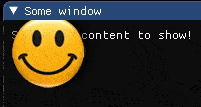
Example:
tImGui              =  require "ImGui"

function onLoop(delta)

    local title     = 'Some window'
    local closeable =  true
    local flags     =  0

    local is_opened, closed_clicked = tImGui.Begin(title, closeable, flags)

    if is_opened then
        tImGui.Text('Some nice content to show!')
        local texture_file_name  = 'HB_smile.png'
        local p1                 = {x=0,y=0}
        local p2                 = {x=0,y=100}
        local p3                 = {x=100,y=100}
        local p4                 = {x=100,y=0}
        local color              = {r=1,g=1,b=1,a=1}
        local uv1                = {x=0,y=0}
        local uv2                = {x=0,y=1}
        local uv3                = {x=1,y=1}
        local uv4                = {x=1,y=0}
        tImGui.AddImageQuad(texture_file_name, p1, p2, p3, p4, color, uv1, uv2, uv3, uv4)
    end
    tImGui.End()
end
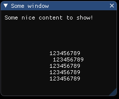
29.10.4. AddText
- AddText(pos, color, text_begin, text_end)
- Parameters
table – pos
{x,y}table – color
{r,g,b,a}string – text_begin
string – text_end
might be omitted
Example:
tImGui            =  require "ImGui"
function onLoop(delta)

    local title     = 'Some window'
    local closeable =  true
    local flags     =  0

    local is_opened, closed_clicked = tImGui.Begin(title, closeable, flags)

    if is_opened then
        tImGui.Text('Some nice content to show!')
        local ImVec2  = tImGui.GetWindowPos()

        local pos         = {x=100 + ImVec2.x,y=100 + ImVec2.y}
        local color       = {r=1,g=1,b=1,a=1}
        local text_begin  = '123456789 \n 123456789 \n123456789 \n123456789 \n123456789 \n'

        tImGui.AddText(pos, color, text_begin)
    end
    tImGui.End()
end
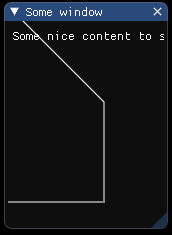
29.10.5. AddPolyline
- AddPolyline(points, color, closed, thickness)
- Parameters
table – points
{{x,y},{x,y},{x,y},...}table – color
{r,g,b,a}boolean – closed
number – thickness
Example:
tImGui            =  require "ImGui"
function onLoop(delta)

    local title     = 'Some window'
    local closeable =  true
    local flags     =  0

    local is_opened, closed_clicked = tImGui.Begin(title, closeable, flags)

    if is_opened then
        tImGui.Text('Some nice content to show!')

        local winPos      = tImGui.GetWindowPos()
        local points      = {{x=0,y=0},{x=100,y=100},{x=100,y=200},{x=0,y=200}}
        local color       = {r=1,g=1,b=1,a=1}
        local closed      = false
        local thickness   = 1

        for i=1, #points do
            points[i].x = points[i].x + winPos.x
            points[i].y = points[i].y + winPos.y
        end

        tImGui.AddPolyline(points, color, closed, thickness)
    end
    tImGui.End()
end
29.10.6. AddNgonFilled
- AddNgonFilled(center, radius, color, num_segments)
- Parameters
table – center
{x,y}number – radius
table – color
{r,g,b,a}number – num_segments
Example:
tImGui              =  require "ImGui"
function onLoop(delta)

    local title     = 'Some window'
    local closeable =  true
    local flags     =  0

    local is_opened, closed_clicked = tImGui.Begin(title, closeable, flags)

    if is_opened then
        tImGui.Text('Some nice content to show!')

        local winPos      = tImGui.GetWindowPos()

        local center        = {x=winPos.x + 100,y=winPos.y + 100}
        local radius        = 15
        local color         = {r=1,g=1,b=1,a=1}
        local num_segments  = 15

        tImGui.AddNgonFilled(center, radius, color, num_segments)
    end
    tImGui.End()
end

tImGui.AddNgonFilled(center, radius, color, num_segments)
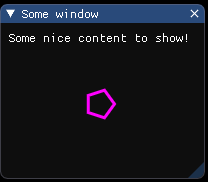
29.10.7. AddNgon
- AddNgon(center, radius, color, num_segments, thickness)
- Parameters
table – center
{x,y}number – radius
table – color
{r,g,b,a}number – num_segments
number – thickness
Example:
tImGui              =  require "ImGui"
function onLoop(delta)

    local title     = 'Some window'
    local closeable =  true
    local flags     =  0

    local is_opened, closed_clicked = tImGui.Begin(title, closeable, flags)

    if is_opened then
        tImGui.Text('Some nice content to show!')

        local winPos      = tImGui.GetWindowPos()

        local center        = {x=winPos.x + 100,y=winPos.y + 100}
        local radius        = 15
        local color         = {r=1,g=0,b=1,a=1}
        local num_segments  = 5
        local thickness     =  3.0

        tImGui.AddNgon(center, radius, color, num_segments, thickness)
    end
    tImGui.End()
end
29.10.8. AddCircle
- AddCircle(center, radius, color, num_segments, thickness)
- Parameters
table – center
{x,y}number – radius
table – color
{r,g,b,a}number – num_segments
number – thickness
Example:
tImGui              =  require "ImGui"
function onLoop(delta)

    local title     = 'Some window'
    local closeable =  true
    local flags     =  0

    local is_opened, closed_clicked = tImGui.Begin(title, closeable, flags)

    if is_opened then
        tImGui.Text('Some nice content to show!')

        local winPos      = tImGui.GetWindowPos()

        local center        = {x=winPos.x + 50,y=winPos.y + 50}
        local radius        = 15
        local color         = {r=1,g=0,b=0,a=0.8}
        local num_segments  = 12
        local thickness     = 1.0

        tImGui.AddCircle(center, radius, color, num_segments, thickness)
    end
    tImGui.End()
end
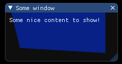
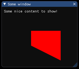
29.10.9. AddConvexPolyFilled
- AddConvexPolyFilled(points, color)
Note: Anti-aliased filling requires points to be in clockwise order.
- Parameters
table – points
{{x,y},{x,y},{x,y},...}table – color
{r,g,b,a}
Example:
tImGui            =  require "ImGui"
function onLoop(delta)

    local title     = 'Some window'
    local closeable =  true
    local flags     =  0

    local is_opened, closed_clicked = tImGui.Begin(title, closeable, flags)

    if is_opened then

        local winPos      = tImGui.GetWindowPos()

        local points      = {{x=10,y=10},{x=200,y=10},{x=200,y=100},{x=30,y=90}}
        local color       = {r=0,g=0.2,b=1,a=0.5}

        for i=1, #points do
            points[i].x = points[i].x + winPos.x
            points[i].y = points[i].y + winPos.y
        end

        tImGui.AddConvexPolyFilled(points, color)

        tImGui.Text('Some nice content to show!')
    end
    tImGui.End()
end
29.10.10. AddImage
- AddImage(texture_file_name, p_min, p_max, color, uv_min, uv_max)
- Parameters
string – texture file name or
number( id of texture )table – p_min
{x,y}table – p_max
{x,y}table – color
{r,g,b,a}default is{r=1,g=1,b=1,a=1}table – uv_min
{x,y}default is{x=0,y=0}table – uv_max
{x,y}default is{x=1,y=1}
Example:
tImGui                   =  require "ImGui"
function onLoop(delta)

    local title     = 'Some window'
    local closeable =  true
    local flags     =  0

    local is_opened, closed_clicked = tImGui.Begin(title, closeable, flags)

    if is_opened then

        local winPos      = tImGui.GetWindowPos()

        local texture_file_name  =  'HB_smile.png'
        local color              =  {r=1,g=1,b=1,a=1}
        local p_min              =  winPos
        local p_max              =  {x=winPos.x + 100,y= winPos.y + 100}
        local uv_min             =  {x=0,y=0}
        local uv_max             =  {x=1,y=1}

        tImGui.AddImage(texture_file_name, p_min, p_max, color, uv_min,uv_max )

        tImGui.Text('Some nice content to show!')
    end
    tImGui.End()
end
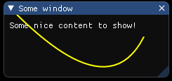
29.10.11. AddBezierCubic
- AddBezierCubic(p1, p2, p3, p4, color, thickness, num_segments)
Cubic Bezier (4 control points). Renamed from AddBezierCurve in ImGui 1.80.
- Parameters
table – p1
{x,y}table – p2
{x,y}table – p3
{x,y}table – p4
{x,y}table – color
{r,g,b,a}number – thickness
number – num_segments (default: 0)
Example:
tImGui              =  require "ImGui"
function onLoop(delta)

    local title     = 'Some window'
    local closeable =  true
    local flags     =  0

    local is_opened, closed_clicked = tImGui.Begin(title, closeable, flags)

    if is_opened then

        tImGui.Text('Some nice content to show!')

        local winPos        = tImGui.GetWindowPos()

        local p1            = winPos
        local p2            = {x=winPos.x + 50,y=winPos.y + 50}
        local p3            = {x=winPos.x + 150,y=winPos.y + 150}
        local p4            = {x=winPos.x + 200,y=winPos.y + 50}
        local color         = {r = 1,g = 1,b = 0,a = 1}
        local thickness     = 2
        local num_segments  = 30

        tImGui.AddBezierCubic(p1, p2, p3, p4, color, thickness, num_segments)

    end
    tImGui.End()
end
29.10.12. AddDrawCmd
- AddDrawCmd
This is useful if you need to forcefully create a new draw call (to allow for dependent rendering / blending). Otherwise primitives are merged into the same draw-call as much as possible
Example:
tImGui  =  require "ImGui"
tImGui.AddDrawCmd()
29.10.13. AddImageRounded
- AddImageRounded(texture_file_name, p_min, p_max, uv_min, uv_max, color, rounding, rounding_corners)
- Parameters
string – texture file name or
number( id of texture )table – p_min
{x,y}table – p_max
{x,y}table – color
{r,g,b,a}table – uv_min
{x,y}default is{x=0,y=0}table – uv_max
{x,y}default is{x=1,y=1}number – rounding default is
0.0number – rounding_corners default is
ImDrawCornerFlags_All
Example:
tImGui                  =  require "ImGui"
function onLoop(delta)

    local title     = 'Some window'
    local closeable =  true
    local flags     =  0

    local is_opened, closed_clicked = tImGui.Begin(title, closeable, flags)

    if is_opened then

        tImGui.Text('Some nice content to show!')

        local winPos      = tImGui.GetWindowPos()

        local texture_file_name = 'crate.png'
        local p_min             = {x= 100,y= 100}
        local p_max             = {x= 200,y= 200}
        local color             = {r=1,g=1,b=1,a=1}
        local uv_min            = {x=0,y=0}
        local uv_max            = {x=1,y=1}
        local rounding          = 20.0
        local rounding_corners  =  tImGui.Flags('ImDrawCornerFlags_All')

        tImGui.AddImageRounded(texture_file_name, p_min, p_max, color, uv_min, uv_max, rounding, rounding_corners)

    end
    tImGui.End()
end

Figure 29.2 Texture original
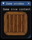
Figure 29.3 AddImageRounded
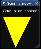
29.10.14. AddTriangleFilled
- AddTriangleFilled(p1, p2, p3, color)
- Parameters
table – p1
{x,y}table – p2
{x,y}table – p3
{x,y}table – color
{r,g,b,a}
Example:
tImGui       =  require "ImGui"
function onLoop(delta)
    local title     = 'Some window'
    local closeable =  true
    local flags     =  0

    local is_opened, closed_clicked = tImGui.Begin(title, closeable, flags)

    if is_opened then

        tImGui.Text('Some nice content to show!')

        local p1     = {x=10,y=100}
        local p2     = {x=50,y=200}
        local p3     = {x=100,y=100}
        local color  = {r=1,g=1,b=0,a=1}

        tImGui.AddTriangleFilled(p1, p2, p3, color)

    end
    tImGui.End()
end
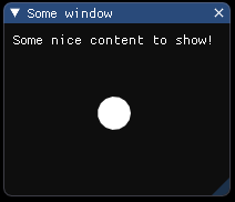
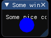
29.10.15. AddCircleFilled
- AddCircleFilled(center, radius, color, num_segments)
- Parameters
table – center
{x,y}number – radius
table – color
{r,g,b,a}number – num_segments
Example:
tImGui              =  require "ImGui"
function onLoop(delta)

    local title     = 'Some window'
    local closeable =  true
    local flags     =  0

    local is_opened, closed_clicked = tImGui.Begin(title, closeable, flags)

    if is_opened then

        tImGui.Text('Some nice content to show!')

        local winPos        = tImGui.GetWindowPos()
        local center        = {x=winPos.x + 50,y=winPos.y + 50}
        local radius        = 15
        local color         = {r=0,g=0,b=1,a=1}
        local num_segments  =  12

        tImGui.AddCircleFilled(center, radius, color, num_segments)

    end
    tImGui.End()
end
29.10.16. AddLine
- AddLine(p1, p2, color, thickness)
- Parameters
table – p1
{x,y}table – p2
{x,y}number – color
{r,g,b,a}number – thickness
Example:
tImGui           =  require "ImGui"
function onLoop(delta)

    local title     = 'Some window'
    local closeable =  true
    local flags     =  0

    local is_opened, closed_clicked = tImGui.Begin(title, closeable, flags)

    if is_opened then

        tImGui.Text('Some nice content to show!')

        local winPos     = tImGui.GetWindowPos()
        local p1         = winPos
        local p2         = {x = winPos.x + 50, y = winPos.y + 50}
        local color      = {r=1, g=1, b=0, a=1}
        local thickness  =  1.0

        tImGui.AddLine(p1, p2, color, thickness)

    end
    tImGui.End()
end

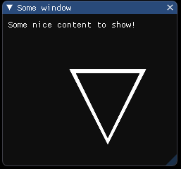
29.10.17. AddTriangle
- AddTriangle(p1, p2, p3, color, thickness)
- Parameters
table – p1
{x,y}table – p2
{x,y}table – p3
{x,y}table – color
{r,g,b,a}number – thickness
Example:
tImGui       =  require "ImGui"
function onLoop(delta)

    local title     = 'Some window'
    local closeable =  true
    local flags     =  0

    local is_opened, closed_clicked = tImGui.Begin(title, closeable, flags)

    if is_opened then

        tImGui.Text('Some nice content to show!')

        local winPos     = tImGui.GetWindowPos()
        local p1     = {x=100 + winPos.x,y=100 + winPos.y}
        local p2     = {x=150 + winPos.x,y=200 + winPos.y}
        local p3     = {x=200 + winPos.x,y=100 + winPos.y}
        local color  = {r=1,g=1,b=1,a=1}
        local thickness  =  10.0

        tImGui.AddTriangle(p1, p2, p3, color, thickness)

    end
    tImGui.End()
end
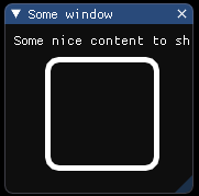
29.10.18. AddRect
- AddRect(p_min, p_max, color, rounding, rounding_corners, thickness)
A: upper-left, b: lower-right (== upper-left + size), rounding_corners_flags: 4 bits corresponding to which corner to round
- Parameters
table – p_min
{x,y}table – p_max
{x,y}table – color
{r,g,b,a}number – rounding
table – rounding_corners
number – thickness
Example:
tImGui                  =  require "ImGui"
function onLoop(delta)

    local title     = 'Some window'
    local closeable =  true
    local flags     =  0

    local is_opened, closed_clicked = tImGui.Begin(title, closeable, flags)

    if is_opened then

        tImGui.Text('Some nice content to show!')

        local p_min             = {x=100,y=100}
        local p_max             = {x=200,y=200}
        local color             = {r=1,g=1,b=1,a=1}
        local rounding          =  10.0
        local rounding_corners  =  tImGui.Flags('ImDrawCornerFlags_All')
        local thickness         =  5.0

        tImGui.AddRect(p_min, p_max, color, rounding, rounding_corners, thickness)

    end
    tImGui.End()
end
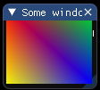
29.10.19. AddRectFilledMultiColor
- AddRectFilledMultiColor(p_min, p_max, color_upr_left, color_upr_right, color_bot_right, color_bot_left)
- Parameters
table – p_min
{x,y}table – p_max
{x,y}table – color_upr_left
{r,g,b,a}table – color_upr_right
{r,g,b,a}table – color_bot_right
{r,g,b,a}table – color_bot_left
{r,g,b,a}
Example:
tImGui               =  require "ImGui"
function onLoop(delta)

    local title     = 'Some window'
    local closeable =  true
    local flags     =  0

    local is_opened, closed_clicked = tImGui.Begin(title, closeable, flags)

    if is_opened then

        tImGui.Text('Some nice content to show!')

        local winPos         = tImGui.GetWindowPos()
        local p_min          = winPos
        local p_max          = {x = winPos.x +  100, y = winPos.y + 90}
        local color_upr_left   = {r = 1, g = 0, b = 0, a = 1}
        local color_upr_right  = {r = 0, g = 1, b = 0, a = 1}
        local color_bot_right  = {r = 0, g = 0, b = 1, a = 1}
        local color_bot_left   = {r = 1, g = 1, b = 0, a = 1}

        tImGui.AddRectFilledMultiColor(p_min, p_max, color_upr_left, color_upr_right, color_bot_right, color_bot_left)

    end
    tImGui.End()
end
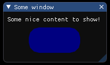
29.10.20. AddRectFilled
- AddRectFilled(p_min, p_max, color, rounding, rounding_corners)
A: upper-left, b: lower-right (== upper-left + size)
- Parameters
table – p_min
{x,y}table – p_max
{x,y}table – color
{r,g,b,a}number – rounding
number – rounding_corners
Example:
tImGui                  =  require "ImGui"
function onLoop(delta)

    local title     = 'Some window'
    local closeable =  true
    local flags     =  0

    local is_opened, closed_clicked = tImGui.Begin(title, closeable, flags)

    if is_opened then

        tImGui.Text('Some nice content to show!')

        local winPos         = tImGui.GetWindowPos()
        local p_min             = {x=winPos.x + 50,y=winPos.y + 50}
        local p_max             = {x=winPos.x + 150,y=winPos.y + 100}
        local color             = {r=0,g=0,b=0.5,a=1}
        local rounding          =  20.0
        local rounding_corners  =  tImGui.Flags('ImDrawCornerFlags_All')

        tImGui.AddRectFilled(p_min, p_max, color, rounding, rounding_corners)

    end
    tImGui.End()
end
29.10.21. AddQuadFilled
- AddQuadFilled(p1, p2, p3, p4, color)
- Parameters
table – p1
{x,y}table – p2
{x,y}table – p3
{x,y}table – p4
{x,y}table – color
{r,g,b,a}
Example:
tImGui       =  require "ImGui"
function onLoop(delta)

    local title     = 'Some window'
    local closeable =  true
    local flags     =  0

    local is_opened, closed_clicked = tImGui.Begin(title, closeable, flags)

    if is_opened then

        tImGui.Text('Some nice content to show!')

        local winPos = tImGui.GetWindowPos()
        local p1     = {x= winPos.x + 100 ,y = winPos.y + 100}
        local p2     = {x= winPos.x + 200 ,y = winPos.y + 100}
        local p3     = {x= winPos.x + 200 ,y = winPos.y + 200}
        local p4     = {x= winPos.x + 100 ,y = winPos.y + 150}
        local color  = {r=1,g=0,b=0,a=1}

        tImGui.AddQuadFilled(p1, p2, p3, p4, color)

    end
    tImGui.End()
end
29.10.22. AddQuad
- AddQuad(p1, p2, p3, p4, color, thickness)
- Parameters
table – p1
{x,y}table – p2
{x,y}table – p3
{x,y}table – p4
{x,y}table – color
{r,g,b,a}number – thickness
Example:
tImGui           =  require "ImGui"
function onLoop(delta)

    local title     = 'Some window'
    local closeable =  true
    local flags     =  0

    local is_opened, closed_clicked = tImGui.Begin(title, closeable, flags)

    if is_opened then

        tImGui.Text('Some nice content to show!')

        local winPos     = tImGui.GetWindowPos()
        local p1         = {x= winPos.x + 100 ,y = winPos.y + 100}
        local p2         = {x= winPos.x + 200 ,y = winPos.y + 100}
        local p3         = {x= winPos.x + 200 ,y = winPos.y + 200}
        local p4         = {x= winPos.x + 100 ,y = winPos.y + 150}
        local color      = {r=1,g=1,b=1,a=1}
        local thickness  =  10.0

        tImGui.AddQuad(p1, p2, p3, p4, color, thickness)

    end
    tImGui.End()
end
Note
PushTextureID/PopTextureID were removed in ImGui 1.89+ (ImDrawList::PushTextureID was removed).
NB: all primitives needs to be reserved via PrimReserve() beforehand!
29.11. Is methods
29.11.1. IsAnyItemHovered
- IsAnyItemHovered
Is any item hovered?
- Returns
boolean- result
Example:
tImGui  =  require "ImGui"
local hovered = tImGui.IsAnyItemHovered()
print(hovered)
29.11.2. IsAnyMouseDown
- IsAnyMouseDown
Is any mouse button held?
- Returns
boolean- result
Example:
tImGui       =  require "ImGui"
local result = tImGui.IsAnyMouseDown()
print(result)
29.11.3. IsAnyWindowHovered
- IsAnyWindowHovered
- Returns
boolean- result
Example:
tImGui       =  require "ImGui"
local result = tImGui.IsAnyWindowHovered()
print(result)
29.11.4. IsAnyWindowFocused
- IsAnyWindowFocused
- Returns
boolean- result
Example:
tImGui       =  require "ImGui"
local result = tImGui.IsAnyWindowFocused()
print(result)
29.11.5. IsAnyItemFocused
- IsAnyItemFocused
Is any item focused?
- Returns
boolean- result
Example:
tImGui       =  require "ImGui"
local result = tImGui.IsAnyItemFocused()
print(result)
29.11.6. IsAnyItemActive
- IsAnyItemActive
Is any item active?
- Returns
boolean- result
Example:
tImGui       =  require "ImGui"
local result = tImGui.IsAnyItemActive()
print(result)
29.11.7. IsItemDeactivatedAfterEdit
- IsItemDeactivatedAfterEdit
Was the last item just made inactive and made a value change when it was active? (e.g. Slider/Drag moved). Useful for Undo/Redo patterns with widgets that requires continuous editing. Note that you may get false positives (some widgets such as Combo()/ListBox()/Selectable() will return true even when clicking an already selected item).
- Returns
boolean- result
Example:
tImGui       =  require "ImGui"
local result = tImGui.IsItemDeactivatedAfterEdit()
print(result)
29.11.8. IsItemEdited
- IsItemEdited
Did the last item modify its underlying value this frame? or was pressed? This is generally the same as the “bool” return value of many widgets.
- Returns
boolean- result
Example:
tImGui       =  require "ImGui"
local result = tImGui.IsItemEdited()
print(result)
29.11.9. IsItemToggledOpen
- IsItemToggledOpen
Was the last item open state toggled? set by TreeNode().
- Returns
boolean- result
Example:
tImGui       =  require "ImGui"
local result = tImGui.IsItemToggledOpen()
print(result)
29.11.10. IsItemDeactivatedAfterChange
- IsItemDeactivatedAfterChange
- Returns
boolean- result
Example:
tImGui       =  require "ImGui"
local result = tImGui.IsItemDeactivatedAfterChange()
print(result)
29.11.11. IsItemDeactivated
- IsItemDeactivated
Was the last item just made inactive (item was previously active). Useful for Undo/Redo patterns with widgets that requires continuous editing.
- Returns
boolean- result
Example:
tImGui       =  require "ImGui"
local result = tImGui.IsItemDeactivated()
print(result)
29.11.12. IsItemActive
- IsItemActive
Is the last item active? (e.g. button being held, text field being edited. This will continuously return true while holding mouse button on an item. Items that don’t interact will always return false)
- Returns
boolean- result
Example:
tImGui       =  require "ImGui"
local result = tImGui.IsItemActive()
print(result)
29.11.13. IsItemHovered
- IsItemHovered(flags)
Is the last item hovered? (and usable, aka not blocked by a popup, etc.). See ImGuiHoveredFlags for more options.
- Parameters
number – flags
- Returns
boolean- result
Example:
tImGui       =  require "ImGui"
local flags  =  0
local result = tImGui.IsItemHovered(flags)
print(result)
29.11.14. IsItemActivated
- IsItemActivated
Was the last item just made active (item was previously inactive).
- Returns
boolean- result
Example:
tImGui       =  require "ImGui"
local result = tImGui.IsItemActivated()
print(result)
29.11.15. IsItemVisible
- IsItemVisible
Is the last item visible? (items may be out of sight because of clipping/scrolling)
- Returns
boolean- result
Example:
tImGui       =  require "ImGui"
local result = tImGui.IsItemVisible()
print(result)
29.11.16. IsItemFocused
- IsItemFocused
Is the last item focused for keyboard/gamepad navigation?
- Returns
boolean- result
Example:
tImGui       =  require "ImGui"
local result = tImGui.IsItemFocused()
print(result)
29.11.17. IsItemClicked
- IsItemClicked(mouse_button)
Is the last item clicked? (e.g. button/node just clicked on) == IsMouseClicked(mouse_button) && IsItemHovered()
- Parameters
number – mouse_button (0=left, 1=right, 2=middle)
- Returns
boolean- result
Example:
tImGui              =  require "ImGui"
local mouse_button  =  0
local result = tImGui.IsItemClicked(mouse_button)
print(result)
29.11.18. IsKeyReleased
- IsKeyReleased(ImGuiKey)
Was key released (went from Down to !Down)?
- Parameters
string – ImGuiKey or raw index as
number- Returns
boolean- result
Example:
tImGui                =  require "ImGui"
local ImGuiKey        = 'ImGuiKey_Enter'
local result          = tImGui.IsKeyReleased(ImGuiKey)
print(result)
29.11.19. IsKeyDown
- IsKeyDown(ImGuiKey)
Is key being held. == io.KeysDown[key_index].
- Parameters
string – ImGuiKey or raw index as
number- Returns
boolean- result
Example:
tImGui                =  require "ImGui"
local ImGuiKey        = 'ImGuiKey_A'
local result          = tImGui.IsKeyDown(ImGuiKey)
print(result)
29.11.20. IsKeyPressed
- IsKeyPressed(ImGuiKey, is_repeated)
Was key pressed (went from !Down to Down)? if is_repeated =
true, uses io.KeyRepeatDelay / KeyRepeatRate- Parameters
string – ImGuiKey or raw index as
numberboolean – is_repeated
- Returns
boolean- result
Example:
tImGui                =  require "ImGui"
local ImGuiKey        = 'ImGuiKey_Space'
local is_repeated     =  true
local result          = tImGui.IsKeyPressed(ImGuiKey,is_repeated)
print(result)
29.11.21. IsMouseDown
- IsMouseDown(button)
Is mouse button held? (0=left, 1=right, 2=middle)
- Parameters
number – button
- Returns
boolean- result
Example:
tImGui                =  require "ImGui"
local button          = 1
local result          = tImGui.IsMouseDown(button)
print(result)
29.11.22. IsMouseDoubleClicked
- IsMouseDoubleClicked(button)
Did mouse button double-clicked? a double-click returns false in IsMouseClicked(). uses io.MouseDoubleClickTime.
- Parameters
number – button
- Returns
boolean- result
Example:
tImGui        =  require "ImGui"
local button  = 0
local result  = tImGui.IsMouseDoubleClicked(button)
print(result)
29.11.23. IsMouseClicked
- IsMouseClicked(button, is_repeated)
Did mouse button clicked? (went from !Down to Down) (0=left, 1=right, 2=middle)
- Parameters
number – button
boolean – is_repeated
- Returns
boolean- result
Example:
tImGui             =  require "ImGui"
local button       = 0
local is_repeated  = false
local result       = tImGui.IsMouseClicked(button,is_repeated)
print(result)
29.11.24. IsMouseHoveringRect
- IsMouseHoveringRect(r_min, r_max, clip)
Is mouse hovering given bounding rect (in screen space). clipped by current clipping settings, but disregarding of other consideration of focus/window ordering/popup-block.
- Parameters
table – r_min
{x,y}table – r_max
{x,y}boolean – clip
- Returns
boolean- result
Example:
tImGui       =  require "ImGui"
local r_min  = {x = 0 , y = 0}
local r_max  = {x = 100 , y = 100}
local clip   = true
local result = tImGui.IsMouseHoveringRect(r_min, r_max, clip)
print(result)
29.11.25. IsMouseDragging
- IsMouseDragging(button, lock_threshold)
Is mouse dragging? (if lock_threshold < -1.0, uses io.MouseDraggingThreshold)
- Parameters
number – button
number – lock_threshold
- Returns
boolean- result
Example:
tImGui                =  require "ImGui"
local button          =  0
local lock_threshold  = -1.0
local result          = tImGui.IsMouseDragging(button, lock_threshold)
print(result)
29.11.26. IsMouseReleased
- IsMouseReleased(button)
Did mouse button released? (went from Down to !Down)
- Parameters
number – button
- Returns
boolean- result
Example:
tImGui        =  require "ImGui"
local button  = 0
local result  = tImGui.IsMouseReleased(button)
print(result)
29.11.27. IsMousePosValid
- IsMousePosValid(mouse_pos)
By convention we use (-FLT_MAX,-FLT_MAX) to denote that there is no mouse available
- Parameters
table – mouse_pos
{x,y}- Returns
boolean- result
Example:
tImGui           =  require "ImGui"
local mouse_pos  = {x=100,y=100}
local result     = tImGui.IsMousePosValid(mouse_pos)
print(result)
29.11.28. IsPopupOpen
- IsPopupOpen(str_id, *flag)
Return true if the popup is open at the current begin-ed level of the popup stack.
- Parameters
string – str_id (might be
nil)param – flag (default is 0)
- Returns
boolean- result
Example:
tImGui        =  require "ImGui"
local str_id  =  '01'
tImGui.IsPopupOpen(str_id)
- IsPopupOpen(id)
Return true if the popup is open at the current begin-ed level of the popup stack.
- param number
id
- return
boolean- result
Example:
tImGui        =  require "ImGui"
local id      =  1
tImGui.IsPopupOpen(id)
29.11.29. IsRectVisible
- IsRectVisible(rect_min, rect_max)
Test if rectangle (in screen space) is visible / not clipped. to perform coarse clipping on user’s side.
- Parameters
table – rect_min
{x,y}table – rect_max
{x,y}
- Returns
boolean- result
Example:
tImGui          =  require "ImGui"
local rect_min  = {x = 0,y = 0}
local rect_max  = {x = 100,y = 100}
local result    = tImGui.IsRectVisible(rect_min, rect_max)
print(result)
29.11.30. IsScrollVisible
- IsScrollVisible
Return the state of the scroll (visible / not visible)
- Returns
boolean- x,boolean- y
Example:
tImGui       =  require "ImGui"
local x,y    = tImGui.IsScrollVisible()
print('Scroll visible in the axis x?',x)
print('Scroll visible in the axis y?',y)
29.11.31. IsWindowFocused
- IsWindowFocused(flags)
Is current window focused? or its root/child, depending on flags. see flags for options.
- Parameters
number – flags
- Returns
boolean- result
Example:
tImGui       =  require "ImGui"
local flags  = 0
local result = tImGui.IsWindowFocused(flags)
print(result)
29.11.32. IsWindowHovered
- IsWindowHovered(flags)
Is current window hovered (and typically: not blocked by a popup/modal)? see flags for options. NB: If you are trying to check whether your mouse should be dispatched to ImGui or to your app, you should use the ‘io.WantCaptureMouse’ boolean for that! Please read the FAQ!
- Parameters
number – flags
- Returns
boolean- result
Example:
tImGui       =  require "ImGui"
local flags  = 0
local result = tImGui.IsWindowHovered(flags)
print(result)
29.11.33. IsWindowCollapsed
- IsWindowCollapsed
- Returns
boolean- result
Example:
tImGui       =  require "ImGui"
local result = tImGui.IsWindowCollapsed()
print(result)
29.11.34. IsWindowAppearing
- IsWindowAppearing
- Returns
boolean- result
Example:
tImGui       =  require "ImGui"
local result = tImGui.IsWindowAppearing()
print(result)
Note
SaveIniSettingsToMemory, SaveIniSettingsToDisk, LoadIniSettingsFromDisk, LoadIniSettingsFromMemory are not exposed in this Lua wrapper.
29.12. Log methods
29.12.1. LogText
- LogText(text)
Pass text data straight to log (without being displayed)
- Parameters
string – text
Example:
tImGui             =  require "ImGui"
local text         = 'some log ..'

tImGui.LogText(text)
29.12.2. LogFinish
- LogFinish
Stop logging (close file, etc.)
Example:
tImGui  =  require "ImGui"
tImGui.LogFinish()
29.12.3. LogButtons
- LogButtons
Helper to display buttons for logging to tty/file/clipboard
Example:
tImGui  =  require "ImGui"
tImGui.LogButtons()
29.12.4. LogToTTY
- LogToTTY(auto_open_depth)
Start logging to tty (stdout)
- Parameters
number – auto_open_depth
Example:
tImGui                 =  require "ImGui"
local auto_open_depth  =  -1
tImGui.LogToTTY(auto_open_depth)
29.12.5. LogToClipboard
- LogToClipboard(auto_open_depth)
Start logging to OS clipboard
- Parameters
number – auto_open_depth
Example:
tImGui                 =  require "ImGui"
local auto_open_depth  =  -1
tImGui.LogToClipboard(auto_open_depth)
29.12.6. LogToFile
- LogToFile(auto_open_depth, filename)
Start logging to file
- Parameters
number – auto_open_depth
string – filename
Example:
tImGui                 =  require "ImGui"
local auto_open_depth  =  -1
local filename         =  'file.log'

tImGui.LogToFile(auto_open_depth, filename)
29.13. NewFrame / EndFrame
The engine calls NewFrame() / EndFrame() automatically. You do not to need to worry if using this module with mbm engine.
29.14. Open / Close methods
29.14.1. OpenPopupOnItemClick
- OpenPopupOnItemClick(str_id, flags)
Helper to open popup when clicked on last item (note: actually triggers on the mouse _released_ event to be consistent with popup behaviors).
- Parameters
string – str_id (might be
nil)number – flags - e.g.
ImGuiPopupFlags_MouseButtonRight(default). Use Flags() for combined flags.
Example:
tImGui              =  require "ImGui"
local str_id        =  nil
local flags         =  tImGui.Flags('ImGuiPopupFlags_MouseButtonRight')
tImGui.OpenPopupOnItemClick(str_id, flags)
29.14.2. OpenPopup
Popups, Modals
The properties of popups windows are:
They block normal mouse hovering detection outside them. (*) - Unless modal, they can be closed by clicking anywhere outside them, or by pressing ESCAPE.
Their visibility state (~bool) is held internally by imgui instead of being held by the programmer as we are used to with regular Begin() calls.
User can manipulate the visibility state by calling OpenPopup().
We default to use the right mouse (ImGuiMouseButton_Right=1) for the Popup Context functions.
Note
You can use IsItemHovered(ImGuiHoveredFlags_AllowWhenBlockedByPopup) to bypass it and detect hovering even when normally blocked by a popup. Those three properties are connected. The library needs to hold their visibility state because it can close popups at any time.
- OpenPopup(str_id)
Call to mark popup as open (don’t call every frame!). popups are closed when user click outside, or if CloseCurrentPopup() is called within a BeginPopup()/EndPopup() block. By default, Selectable()/MenuItem() are calling CloseCurrentPopup(). Popup identifiers are relative to the current ID-stack (so OpenPopup and BeginPopup needs to be at the same level).
- Parameters
string – str_id
Example:
tImGui        =  require "ImGui"
local str_id  =  '01'
tImGui.OpenPopup(str_id)
29.14.3. CloseCurrentPopup
- CloseCurrentPopup
Close the popup we have begin-ed into. clicking on a MenuItem or Selectable automatically close the current popup.
Example:
tImGui  =  require "ImGui"
tImGui.CloseCurrentPopup()
29.15. Pop methods
Note
PopAllowKeyboardFocus is not exposed in this Lua wrapper.
29.15.2. PopItemFlag
- PopItemFlag
Pop item flag. Replaces deprecated PopTabStop/PopButtonRepeat (ImGui 1.90+). Use after PushItemFlag().
Example:
tImGui  =  require "ImGui"
tImGui.PushItemFlag('ImGuiItemFlags_ButtonRepeat', true)
-- ... widget code ...
tImGui.PopItemFlag()
29.16. Push methods
Note
PushFont and PushAllowKeyboardFocus are not exposed in this Lua wrapper.
29.16.1. PushID
ID stack/scopes
Read the FAQ for more details about how ID are handled in dear imgui. If you are creating widgets in a loop you most likely want to push a unique identifier (e.g. object pointer, loop index) to uniquely differentiate them.
The resulting ID are hashes of the entire stack.
You can also use the “Label##foobar” syntax within widget label to distinguish them from each others.
In this header file we use the “label”/”name” terminology to denote a string that will be displayed and used as an ID, whereas “str_id” denote a string that is only used as an ID and not normally displayed.
- PushID(str_id_begin, str_id_end)
Push string into the ID stack (will hash string).
- Parameters
string – str_id_begin
string – str_id_end
Example:
tImGui              =  require "ImGui"
local str_id_begin  = 'id 0'
local str_id_end    = '9'
tImGui.PushID(str_id_begin, str_id_end)
29.16.2. PushID
- PushID(str_id)
Push string into the ID stack (will hash string).
- param string
str_id
Example:
tImGui        =  require "ImGui"
local str_id  =  '01'
tImGui.PushID(str_id)
29.16.3. PushID
- PushID(value)
Push number into the ID stack (will hash int).
- param number
value
Example:
tImGui        =  require "ImGui"
local value   =  1
tImGui.PushID(value)
29.16.4. PushItemFlag
- PushItemFlag(flags, value)
Generic item flag push. Replaces deprecated PushTabStop/PushButtonRepeat (ImGui 1.90+). Use flags such as
ImGuiItemFlags_ButtonRepeat,ImGuiItemFlags_NoTabStop,ImGuiItemFlags_NoNav, etc. (use Flags() or string).- Parameters
string/number – flags - e.g.
'ImGuiItemFlags_ButtonRepeat'or combined flagsboolean – value
Example:
tImGui  =  require "ImGui"
tImGui.PushItemFlag('ImGuiItemFlags_ButtonRepeat', true)
-- ... widget code ...
tImGui.PopItemFlag()
Note
PushButtonRepeat was removed in ImGui 1.90+. Use PushItemFlag(‘ImGuiItemFlags_ButtonRepeat’, true) instead.
29.16.5. PushTextWrapPos
- PushTextWrapPos(wrap_local_pos_x)
Word-wrapping for Text * () commands. < 0.0f: no wrapping; 0.0f: wrap to end of window (or column); > 0.0f: wrap at ‘wrap_pos_x’ position in window local space
- Parameters
number – wrap_local_pos_x
Example:
tImGui                  =  require "ImGui"
local wrap_local_pos_x  =  0.0
tImGui.PushTextWrapPos(wrap_local_pos_x)
29.16.6. PushClipRect
- PushClipRect(clip_rect_min, clip_rect_max, intersect_with_current_clip_rect)
- Parameters
table – clip_rect_min
{x,y}table – clip_rect_max
{x,y}boolean – intersect_with_current_clip_rect
Example:
tImGui                                  =  require "ImGui"
local clip_rect_min                     = {x=0,y=0}
local clip_rect_max                     = {x=0,y=0}
local intersect_with_current_clip_rect  = false
tImGui.PushClipRect(clip_rect_min, clip_rect_max, intersect_with_current_clip_rect)
29.16.7. PushItemWidth
- PushItemWidth(item_width)
Set width of items for common large “item+label” widgets. >0.0f: width in pixels, <0.0f align xx pixels to the right of window (so -1.0 always align width to the right side). 0.0f = default to ~2/3 of windows width,
- Parameters
number – item_width
Example:
tImGui            =  require "ImGui"
local item_width  = 50
tImGui.PushItemWidth(item_width)
29.17. Render
Note
You do not need to call render for this module. It is automatically called by the engine.
29.18. Set methods
29.18.1. SetKeyboardFocusHere
- SetKeyboardFocusHere(offset)
Focus keyboard on the next widget. Use positive ‘offset’ to access sub components of a multiple component widget. Use -1 to access previous widget.
- Parameters
number – offset
Example:
tImGui        =  require "ImGui"
local offset  =  0

tImGui.SetKeyboardFocusHere(offset)
29.18.2. SetMouseCursor
- SetMouseCursor(string cursor_type)
Set desired cursor type
- Parameters
struing – cursor_type valids are:
ImGuiMouseCursor_None,ImGuiMouseCursor_Arrow,ImGuiMouseCursor_TextInput,ImGuiMouseCursor_ResizeAll,ImGuiMouseCursor_ResizeNS,ImGuiMouseCursor_ResizeEW,ImGuiMouseCursor_ResizeNESW,ImGuiMouseCursor_ResizeNWSE,ImGuiMouseCursor_Hand,ImGuiMouseCursor_NotAllowed.
Example:
tImGui             =  require "ImGui"
local cursor_type  = 'ImGuiMouseCursor_Hand'
tImGui.SetMouseCursor(cursor_type)
29.18.3. SetCurrentContext
Note
You do not need to set the context for this module. It is automatically set by the engine.
29.18.4. SetClipboardText
- SetClipboardText(text)
- Parameters
string – text
Example:
tImGui      =  require "ImGui"
local text  = 'your data'
tImGui.SetClipboardText(text)
Note
TODO: On Linux is used just the internal clipboard text.
29.18.5. SetNextTreeNodeOpen
- SetNextTreeNodeOpen(open, cond)
- Parameters
boolean – open
number – condition
Example:
tImGui           = require "ImGui"
local open       = true
local condition  =  0
tImGui.SetNextTreeNodeOpen(open, condition)
29.18.6. SetItemDefaultFocus
- SetItemDefaultFocus
Make last item the default focused item of a window.
Example:
tImGui  =  require "ImGui"
tImGui.SetItemDefaultFocus()
29.18.7. SetScrollHere
- SetScrollHere(center_ratio)
- Parameters
number – center_ratio
Example:
tImGui              =  require "ImGui"
local center_ratio  = 0.5
tImGui.SetScrollHere(center_ratio)
29.18.8. SetNextItemAllowOverlap
- SetNextItemAllowOverlap
Allow next item to be overlapped by a subsequent item. Call before the item. Useful with invisible buttons, selectables, etc. to catch unused area. (Replaces deprecated SetItemAllowOverlap which was obsoleted in ImGui 1.89.7)
Example:
tImGui  =  require "ImGui"
tImGui.SetNextItemAllowOverlap()
tImGui.Selectable("Item")
Note
SetDragDropPayload is not exposed (drag-drop source/target APIs not in this Lua wrapper).
29.18.9. SetWindowFocus
- SetWindowFocus(name)
Set named window to be focused / top-most. use
nilto remove focus.- Parameters
string – name
Example:
tImGui      =  require "ImGui"
local name  = nil

tImGui.SetWindowFocus(name)
29.18.10. SetTabItemClosed
- SetTabItemClosed(tab_or_docked_window_label)
Notify TabBar or Docking system of a closed tab/window ahead (useful to reduce visual flicker on reorderable tab bars). For tab-bar: call after BeginTabBar() and before Tab submissions. Otherwise call with a window name.
- Parameters
string – tab_or_docked_window_label
Example:
tImGui                            =  require "ImGui"
local tab_or_docked_window_label  = 'name'
tImGui.SetTabItemClosed(tab_or_docked_window_label)
Note
SetWindowFontScale was removed in ImGui 1.92.
29.18.11. SetWindowCollapsed
- SetWindowCollapsed(name, collapsed, cond)
(not recommended) set current window collapsed state. prefer using SetNextWindowCollapsed().
- Parameters
string – name (might be
nilfor the current window)boolean – collapsed
number – cond
Example:
tImGui           =  require "ImGui"
local name       = nil
local collapsed  = true
local cond       =  0

tImGui.SetWindowCollapsed(collapsed, cond)
29.18.12. SetWindowSize
- SetWindowSize(name, size, cond)
(not recommended) set current window size - call within Begin()/End(). set to ImVec2(0,0) to force an auto-fit. prefer using SetNextWindowSize(), as this may incur tearing and minor side-effects.
- Parameters
string – name (might be
nilfor the current window)table – size
{x,y}number – cond
Example:
tImGui      =  require "ImGui"
local name  = nil
local size  = {x=200,y=200}
local cond  =  0
tImGui.SetWindowSize(size, cond)
29.18.13. SetCursorPosY
- SetCursorPosY(local_y)
- Parameters
number – local_y
Example:
tImGui         =  require "ImGui"
local local_y  = 100

tImGui.SetCursorPosY(local_y)
29.18.14. SetCursorScreenPos
- SetCursorScreenPos(pos)
Cursor position in absolute screen coordinates [0..io.DisplaySize]
- Parameters
table – pos
Example:
tImGui     =  require "ImGui"
local pos  = {x=0,y=0}
tImGui.SetCursorScreenPos(pos)
29.18.15. SetCursorPosX
- SetCursorPosX(local_x)
GetWindowPos() + GetCursorPos() == GetCursorScreenPos() etc.)
- Parameters
number – local_x
Example:
tImGui         =  require "ImGui"
local local_x  = 0

tImGui.SetCursorPosX(local_x)
29.18.16. SetWindowPos
- SetWindowPos(name, pos, cond)
Set named window position.
- Parameters
string – name might be
nilfor the current window.table – pos
{x,y}number – cond see
ImGuiCond_
Example:
tImGui      =  require "ImGui"
local name  = nil
local pos   = {x=0,y=0}
local cond  =  tImGui.Flags('ImGuiCond_Always')
tImGui.SetWindowPos(name, pos, cond)
29.18.17. SetColorEditOptions
- SetColorEditOptions(flags)
Initialize current options (generally on application startup) if you want to select a default format, picker type, etc. User will be able to change many settings, unless you pass the _NoOptions flag to your calls.
- Parameters
number – flags
Example:
tImGui       =  require "ImGui"
local flags  = 0
tImGui.SetColorEditOptions(flags)
29.18.18. SetNextWindowSize
- SetNextWindowSize(size, cond)
Set next window size. set axis to 0.0f to force an auto-fit on this axis. call before Begin()
- Parameters
table – size
{x,y}number – cond
Example:
tImGui      =  require "ImGui"
local size  = {x=200,y=200}
local cond  =  0
tImGui.SetNextWindowSize(size, cond)
29.18.19. SetNextWindowPos
- SetNextWindowPos(pos, cond, pivot)
Set next window position. call before Begin(). use pivot=(0.5f,0.5f) to center on given point, etc.
- Parameters
table – pos
{x,y}number – cond
table – pivot
{x,y}
Example:
tImGui       =  require "ImGui"
local pos    = {x = 0,y = 100}
local cond   =  0
local pivot  =  {x=0.5,y=0.5}
tImGui.SetNextWindowPos(pos, cond, pivot)
29.18.20. SetNextWindowBgAlpha
- SetNextWindowBgAlpha(alpha)
Set next window background color alpha. helper to easily modify ImGuiCol_WindowBg/ChildBg/PopupBg. you may also use ImGuiWindowFlags_NoBackground.
- Parameters
number – alpha
Example:
tImGui       =  require "ImGui"
local alpha  = 0.5
tImGui.SetNextWindowBgAlpha(alpha)
29.18.21. SetNextWindowSizeConstraints
- SetNextWindowSizeConstraints(size_min, size_max)
Set next window size limits. use -1,-1 on either X/Y axis to preserve the current size. Sizes will be rounded down.
- Parameters
table – size_min
{x,y}table – size_max
{x,y}
Example:
tImGui                          =  require "ImGui"
local size_min                  = {x = 100, y = 200}
local size_max                  = {x = 150, y = 250}
tImGui.SetNextWindowSizeConstraints(size_min, size_max)
29.18.22. SetNextWindowCollapsed
- SetNextWindowCollapsed(collapsed, cond)
Set next window collapsed state. call before Begin()
- Parameters
boolean – collapsed
number – cond
Example:
tImGui           =  require "ImGui"
local collapsed  = true
local cond       =  0

tImGui.SetNextWindowCollapsed(collapsed, cond)
29.18.23. SetNextWindowContentSize
- SetNextWindowContentSize(size)
Set next window content size (~ scrollable client area, which enforce the range of scrollbars). Not including window decorations (title bar, menu bar, etc.) nor WindowPadding. set an axis to 0.0f to leave it automatic. call before Begin()
- Parameters
table – size
{x,y}
Example:
tImGui      =  require "ImGui"
local size  = {x=100,y=100}

tImGui.SetNextWindowContentSize(size)
29.18.24. SetNextWindowFocus
- SetNextWindowFocus
Set next window to be focused / top-most. call before Begin()
Example:
tImGui  =  require "ImGui"
tImGui.SetNextWindowFocus()
29.18.25. SetCursorPos
- SetCursorPos(local_pos)
Using the absolute coordinate system.
- Parameters
table – local_pos
Example:
tImGui           =  require "ImGui"
local local_pos  = {x=0,y=0}
tImGui.SetCursorPos(local_pos)
29.18.26. SetScrollHereX
- SetScrollHereX(center_x_ratio)
Adjust scrolling amount to make current cursor position visible. center_x_ratio=0.0: left, 0.5: center, 1.0: right. When using to make a “default/current item” visible, consider using SetItemDefaultFocus() instead.
- Parameters
number – center_x_ratio
Example:
tImGui                =  require "ImGui"
local center_x_ratio  =  0.5
tImGui.SetScrollHereX(center_x_ratio)
29.18.27. SetScrollY
- SetScrollY(scroll_y)
Set scrolling amount [0..GetScrollMaxY()]
- Parameters
number – scroll_y
Example:
tImGui          =  require "ImGui"
local scroll_y  = 1
tImGui.SetScrollY(scroll_y)
Note
SetColumnOffset was removed with the Columns API. Use Tables API instead.
29.18.28. SetScrollX
- SetScrollX(scroll_x)
Set scrolling amount [0..GetScrollMaxX()]
- Parameters
number – scroll_x
Example:
tImGui          =  require "ImGui"
local scroll_x  = 1
tImGui.SetScrollX(scroll_x)
Note
SetColumnWidth was removed with the Columns API. Use Tables API instead.
29.18.29. SetScrollHereY
- SetScrollHereY(center_y_ratio)
Adjust scrolling amount to make current cursor position visible. center_y_ratio=0.0: top, 0.5: center, 1.0: bottom. When using to make a “default/current item” visible, consider using SetItemDefaultFocus() instead.
- Parameters
number – center_y_ratio
Example:
tImGui                =  require "ImGui"
local center_y_ratio  =  0.5
tImGui.SetScrollHereY(center_y_ratio)
29.18.30. SetNextItemWidth
- SetNextItemWidth(item_width)
Set width of the _next_ common large “item+label” widget. >0.0f: width in pixels, <0.0f align xx pixels to the right of window (so -1.0 always align width to the right side)
- Parameters
number – item_width
Example:
tImGui            =  require "ImGui"
local item_width  = 100
tImGui.SetNextItemWidth(item_width)
29.18.31. SetTooltip
- SetTooltip(text)
Set a text-only tooltip, typically use with ImGui:IsItemHovered(). override any previous call to SetTooltip().
- Parameters
string – text
Example:
tImGui             =  require "ImGui"
local text         = 'tool tip'
tImGui.SetTooltip(text)
29.18.32. SetScrollFromPosY
- SetScrollFromPosY(local_y, center_y_ratio)
Adjust scrolling amount to make given position visible. Generally GetCursorStartPos() + offset to compute a valid position.
- Parameters
number – local_y
number – center_y_ratio
Example:
tImGui                =  require "ImGui"
local local_y         = 1
local center_y_ratio  =  0.5
tImGui.SetScrollFromPosY(local_y, center_y_ratio)
29.18.33. SetScrollFromPosX
- SetScrollFromPosX(local_x, center_x_ratio)
Adjust scrolling amount to make given position visible. Generally GetCursorStartPos() + offset to compute a valid position.
- Parameters
number – local_x
number – center_x_ratio
Example:
tImGui                =  require "ImGui"
local local_x         =  0
local center_x_ratio  =  0.5
tImGui.SetScrollFromPosX(local_x, center_x_ratio)
29.19. Tables & Columns
Note
Most settings are configured on a per-table basis via the flags passed to BeginTable() and TableSetupColumn(). See Demo>Tables&Columns in imgui_demo for examples.
29.19.1. BeginTable / EndTable
- BeginTable(str_id, columns, flags, outer_size, inner_width)
Create a table. Returns true if the table is visible. Only call EndTable() if BeginTable() returns true!
- Parameters
string – str_id - Unique identifier for the table
number – columns - Number of columns
number – flags - ImGuiTableFlags (optional, default 0). Use imgui.Flags() to combine:
ImGuiTableFlags_Borders,ImGuiTableFlags_RowBg,ImGuiTableFlags_Resizable,ImGuiTableFlags_ScrollX,ImGuiTableFlags_ScrollY, etc.table – outer_size -
{x,y}outer size (optional, default{0,0}). Required when using ScrollX/ScrollY.number – inner_width - Inner width (optional, default 0)
- Returns
boolean- visible
- EndTable
End the table. Only call if BeginTable() returned true!
29.19.2. TableSetupColumn
- TableSetupColumn(label, flags, init_width_or_weight, user_id)
Setup column. Call before TableHeadersRow() or first row. Use to specify label, resizing policy, default width/weight.
- Parameters
string – label - Column header label
number – flags - ImGuiTableColumnFlags (optional).
ImGuiTableColumnFlags_WidthFixed,ImGuiTableColumnFlags_WidthStretch,ImGuiTableColumnFlags_NoResize, etc.number – init_width_or_weight - Initial width (for WidthFixed) or weight (for WidthStretch). Optional, default 0.
number – user_id - User ID. Optional, default 0.
29.19.3. TableSetupScrollFreeze
- TableSetupScrollFreeze(cols, rows)
Lock columns/rows so they stay visible when scrolled. Call after BeginTable(), before first row.
- Parameters
number – cols - Number of columns to freeze (left)
number – rows - Number of rows to freeze (top)
29.19.4. TableNextRow / TableNextColumn / TableSetColumnIndex
- TableNextRow(row_flags, min_row_height)
Append into the first cell of a new row. Call before each row of data.
- Parameters
number – row_flags - ImGuiTableRowFlags (optional).
ImGuiTableRowFlags_Headersfor header row.number – min_row_height - Minimum row height. Optional, default 0.
- TableNextColumn
Append into the next column (or first column of next row if at last column). Returns true when column is visible.
- Returns
boolean- visible
- TableSetColumnIndex(column_n)
Append into the specified column. Returns true when column is visible.
- Parameters
number – column_n - Column index (0-based)
- Returns
boolean- visible
29.19.5. TableHeadersRow / TableHeader / TableAngledHeadersRow
- TableHeadersRow
Submit a row with header cells based on data provided to TableSetupColumn(). Required for reordering, sorting, context menu.
- TableHeader(label)
Submit one header cell manually (rarely used - prefer TableHeadersRow()).
- Parameters
string – label
- TableAngledHeadersRow
Submit angled headers for every column with ImGuiTableColumnFlags_AngledHeader. Must be first row.
29.19.6. Table queries
- TableGetColumnCount
Return number of columns (value passed to BeginTable).
- Returns
number
- TableGetColumnIndex
Return current column index.
- Returns
number
- TableGetRowIndex
Return current row index (header rows accounted for).
- Returns
number
- TableGetColumnName(column_n)
Return column name from TableSetupColumn(). Pass -1 for current column.
- Parameters
number – column_n - Column index, or -1 for current
- Returns
string
- TableGetColumnFlags(column_n)
Return column flags (Enabled, Visible, Sorted, Hovered status). Pass -1 for current column.
- Parameters
number – column_n - Column index, or -1 for current
- Returns
number
- TableGetHoveredColumn
Return hovered column index. -1 when table not hovered. Returns columns_count if unused space at right is hovered.
- Returns
number
29.19.7. TableSetColumnEnabled / TableSetBgColor
- TableSetColumnEnabled(column_n, v)
Change user-accessible enabled/disabled state of a column. Set to false to hide.
- Parameters
number – column_n
boolean – v
- TableSetBgColor(target, color, column_n)
Change background color of a cell, row, or column.
- Parameters
number – target - ImGuiTableBgTarget:
ImGuiTableBgTarget_RowBg0,ImGuiTableBgTarget_RowBg1,ImGuiTableBgTarget_CellBgtable/number – color -
{r,g,b,a}or ImU32 integernumber – column_n - Column index, or -1 for current. Optional.
Example: Basic table
tImGui = require "ImGui"
function onLoop(delta)
    if tImGui.Begin("Window") then
        if tImGui.BeginTable("table1", 3) then
            for row = 0, 3 do
                tImGui.TableNextRow()
                for col = 0, 2 do
                    tImGui.TableSetColumnIndex(col)
                    tImGui.Text("Row " .. row .. " Col " .. col)
                end
            end
            tImGui.EndTable()
        end
        tImGui.End()
    end
end
Example: Table with headers and borders
tImGui = require "ImGui"
function onLoop(delta)
    if tImGui.Begin("Window") then
        local flags = tImGui.Flags("ImGuiTableFlags_Borders", "ImGuiTableFlags_RowBg")
        if tImGui.BeginTable("table1", 3, flags) then
            tImGui.TableSetupColumn("One")
            tImGui.TableSetupColumn("Two")
            tImGui.TableSetupColumn("Three")
            tImGui.TableHeadersRow()
            for row = 0, 4 do
                tImGui.TableNextRow()
                tImGui.TableNextColumn()
                tImGui.Text("Row " .. row)
                tImGui.TableNextColumn()
                tImGui.Text("Some contents")
                tImGui.TableNextColumn()
                tImGui.Text("123.456")
            end
            tImGui.EndTable()
        end
        tImGui.End()
    end
end
Note
Columns API (Columns, NextColumn, GetColumnIndex, etc.) was removed in ImGui 1.92. Use Tables API instead.
29.20. Show methods
29.20.1. ShowUserGuide
- ShowUserGuide
Add basic help/info block (not a window): how to manipulate ImGui as a end-user (mouse/keyboard controls).
Example:
tImGui  =  require "ImGui"
tImGui.ShowUserGuide()
29.20.2. ShowFontSelector
- ShowFontSelector(label)
Add font selector block (not a window), essentially a combo listing the loaded fonts.
- Parameters
string – label
Example:
tImGui       =  require "ImGui"
function onLoop(delta)
    tImGui.ShowFontSelector('Font')
end
29.20.3. ShowStyleSelector
- ShowStyleSelector(label)
Add style selector block (not a window), essentially a combo listing the default styles.
- Parameters
string – label
- Returns
boolean- result
Example:
tImGui       =  require "ImGui"
local label  = 'label'
function onLoop(delta)
    tImGui.ShowStyleSelector('Selector')
end
29.21. Style methods
29.21.1. PushStyleColor
- PushStyleColor(styleColorEnum, color)
- Parameters
string – styleColorEnum (see GuiStyle) or
number(0 toImGuiCol_COUNT-1)table – color rgb
{r,g,b,a}or{x,y,z,w}
Example:
tImGui       =  require "ImGui"
local idx    = tImGui.Flags('ImGuiCol_ButtonHovered')
local color  = {r=1,g=0,b=0.3,a=1}
tImGui.PushStyleColor(idx, color)
- PushStyleColor(styleColorEnum, color)
- param string
styleColorEnum (see GuiStyle) or
number(0 toImGuiCol_COUNT-1)- param number
color
Example:
tImGui       =  require "ImGui"
local color  = 0xff0000ff
tImGui.PushStyleColor('ImGuiCol_ButtonHovered', color)
29.21.2. PopStyleColor
- PopStyleColor(count)
- Parameters
number – count
Example:
tImGui       =  require "ImGui"
local count  =  1
tImGui.PopStyleColor(count)
29.21.3. PushStyleVar
- PushStyleVar(ImGuiStyleVar, value)
- Parameters
string – ImGuiStyleVar
table – value
{x,y}ornumber
Example:
tImGui              =  require "ImGui"
local ImGuiStyleVar = 'ImGuiStyleVar_WindowMinSize'
local value         = {x = 400, y = 400}
tImGui.PushStyleVar(ImGuiStyleVar, value)
- PushStyleVar(idx, value)
- param number
idx (0 to
ImGuiStyleVar_COUNT)- param table
value
{x,y}ornumber
Example:
tImGui      =  require "ImGui"
local idx   = tImGui.Flags('ImGuiStyleVar_Alpha')
local value = 0.5
tImGui.PushStyleVar(idx, value)
29.21.4. PopStyleVar
- PopStyleVar(count)
- Parameters
number – count
Example:
tImGui       =  require "ImGui"
local count  =  1
tImGui.PopStyleVar(count)
29.21.5. ImGuiStyleVar flag table
ImGuiStyleVar_Alpha
numberImGuiStyleVar_DisabledAlpha
numberImGuiStyleVar_WindowPadding
{x,y}ImGuiStyleVar_WindowRounding
numberImGuiStyleVar_WindowBorderSize
numberImGuiStyleVar_WindowMinSize
{x,y}ImGuiStyleVar_WindowTitleAlign
{x,y}ImGuiStyleVar_ChildRounding
numberImGuiStyleVar_ChildBorderSize
numberImGuiStyleVar_PopupRounding
numberImGuiStyleVar_PopupBorderSize
numberImGuiStyleVar_FramePadding
{x,y}ImGuiStyleVar_FrameRounding
numberImGuiStyleVar_FrameBorderSize
numberImGuiStyleVar_ItemSpacing
{x,y}ImGuiStyleVar_ItemInnerSpacing
{x,y}ImGuiStyleVar_IndentSpacing
numberImGuiStyleVar_CellPadding
{x,y}ImGuiStyleVar_ScrollbarSize
numberImGuiStyleVar_ScrollbarRounding
numberImGuiStyleVar_ScrollbarPadding
numberImGuiStyleVar_GrabMinSize
numberImGuiStyleVar_GrabRounding
numberImGuiStyleVar_ImageRounding
numberImGuiStyleVar_ImageBorderSize
numberImGuiStyleVar_TabRounding
numberImGuiStyleVar_TabBorderSize
numberImGuiStyleVar_TabMinWidthBase
numberImGuiStyleVar_TabMinWidthShrink
numberImGuiStyleVar_TabBarBorderSize
numberImGuiStyleVar_TabBarOverlineSize
numberImGuiStyleVar_TableAngledHeadersAngle |
numberImGuiStyleVar_TableAngledHeadersTextAlign |
{x,y}ImGuiStyleVar_TreeLinesSize
numberImGuiStyleVar_TreeLinesRounding
numberImGuiStyleVar_ButtonTextAlign
{x,y}ImGuiStyleVar_SelectableTextAlign
{x,y}ImGuiStyleVar_SeparatorTextBorderSize |
numberImGuiStyleVar_SeparatorTextAlign
{x,y}ImGuiStyleVar_SeparatorTextPadding
{x,y}
29.21.6. StyleColorsLight
- StyleColorsLight(ImGuiStyle)
Best used with borders and a custom, thicker font
- Parameters
table – ImGuiStyle (might be
nil)
Example:
tImGui            =  require "ImGui"
local ImGuiStyle  =  nil
tImGui.StyleColorsLight(dst)
29.21.7. StyleColorsDark
- StyleColorsDark(ImGuiStyle)
New, recommended style (default)
- Parameters
table – ImGuiStyle (might be
nil)
Example:
tImGui            =  require "ImGui"
local ImGuiStyle  =  nil
tImGui.StyleColorsDark(ImGuiStyle)
29.21.8. StyleColorsClassic
- StyleColorsClassic(ImGuiStyle)
Classic ImGui style
- Parameters
table – ImGuiStyle (might be
nil)
Example:
tImGui            =  require "ImGui"
local ImGuiStyle  =  nil
tImGui.StyleColorsClassic(ImGuiStyle)
29.21.9. GetStyle
- GetStyle(string * attribute)
Access the Style structure (colors, sizes). Always use PushStyleColor(), PushStyleVar() to modify style mid-frame.
If not supplied attribute then will return the whole structure.
- Returns
table- ImGuiStyle or anattribute
Example:
tImGui  =  require "ImGui"

local WindowPadding = tImGui.GetStyle('WindowPadding')
print(WindowPadding.x,WindowPadding.y)
local ImGuiCol_Button = tImGui.GetStyle('ImGuiCol_Button')
print(ImGuiCol_Button.r,ImGuiCol_Button.g,ImGuiCol_Button.b,ImGuiCol_Button.a)
29.21.10. ImGuiStyle Table
Note
Use ImGuiStyleVar Flag Table +
PushStyleColor(),PushStyleVar()to modify.
ImGuiStyle attribute
Type
FontSizeBase
numberCurrent base font size before external global factors are applied. Use PushFont(NULL, size) to modify. Use ImGui::GetFontSize() to obtain scaled value.
FontScaleMain
numberMain global scale factor. May be set by application once, or exposed to end-user.
FontScaleDpi
numberAdditional global scale factor from viewport/monitor contents scale.
Alpha
numberGlobal alpha applies to everything in <br /> Dear ImGui.
DisabledAlpha
numberAdditional alpha multiplier applied by BeginDisabled(). Multiply over current value of Alpha.
WindowPadding
{x,y}Padding within a window.
WindowRounding
numberRadius of window corners rounding. Set to 0.0f to have rectangular windows.
WindowBorderSize
numberThickness of border around windows. Generally set to 0.0f or 1.0f. (Other values are not well tested and more CPU/GPU costly).
WindowBorderHoverPadding
numberHit-testing extent outside/inside resizing border. Also extend determination of hovered window. Generally meaningfully larger than WindowBorderSize to make it easy to reach borders.
WindowMinSize
{x,y}Minimum window size. This is a global setting. If you want to constraint individual windows, use SetNextWindowSizeConstraints().
WindowTitleAlign
{x,y}Alignment for title bar text. Defaults to (0.0f,0.5f) for left-aligned,vertically centered.
WindowMenuButtonPosition
numberSide of the collapsing/docking button in the title bar (None/Left/Right). Defaults to ImGuiDir_Left.
ChildRounding
numberRadius of child window corners rounding. Set to 0.0f to have rectangular windows.
ChildBorderSize
numberThickness of border around child windows. Generally set to 0.0f or 1.0f. (Other values are not well tested and more CPU/GPU costly).
PopupRounding
numberRadius of popup window corners rounding. (Note that tooltip windows use WindowRounding)
PopupBorderSize
numberThickness of border around popup/tooltip windows. Generally set to 0.0f or 1.0f. (Other values are not well tested and more CPU/GPU costly).
FramePadding
{x,y}Padding within a framed rectangle (used by most widgets).
FrameRounding
numberRadius of frame corners rounding. Set to 0.0f to have rectangular frame (used by most widgets).
FrameBorderSize
numberThickness of border around frames. Generally set to 0.0f or 1.0f. (Other values are not well tested and more CPU/GPU costly).
ItemSpacing
{x,y}Horizontal and vertical spacing between widgets/lines.
ItemInnerSpacing
{x,y}Horizontal and vertical spacing between within elements of a composed widget (e.g. a slider and its label).
CellPadding
{x,y}Padding within a table cell. Cellpadding.x is locked for entire table. CellPadding.y may be altered between different rows.
TouchExtraPadding
{x,y}Expand reactive bounding box for touch-based system where touch position is not accurate enough. Unfortunately we don’t sort widgets so priority on overlap will always be given to the first widget.
IndentSpacing
numberHorizontal indentation when e.g. entering a tree node. Generally == (FontSize + FramePadding.x*2).
ColumnsMinSpacing
numberMinimum horizontal spacing between two columns. Preferably > (FramePadding.x + 1).
ScrollbarSize
numberWidth of the vertical scrollbar, Height of the horizontal scrollbar.
ScrollbarRounding
numberRadius of grab corners for scrollbar.
ScrollbarPadding
numberPadding of scrollbar grab within its frame (same for both axes).
GrabMinSize
numberMinimum width/height of a grab box for slider/scrollbar.
GrabRounding
numberRadius of grabs corners rounding. Set to 0.0f to have rectangular slider grabs.
LogSliderDeadzone
numberThe size in pixels of the dead-zone around zero on logarithmic sliders that cross zero.
ImageRounding
numberRounding of Image() calls.
ImageBorderSize
numberThickness of border around Image() calls.
TabRounding
numberRadius of upper corners of a tab. Set to 0.0f to have rectangular tabs.
TabBorderSize
numberThickness of border around tabs.
TabMinWidthBase
numberMinimum tab width, to make tabs larger than their contents. TabBar buttons are not affected.
TabMinWidthShrink
numberMinimum tab width after shrinking, when using ImGuiTabBarFlags_FittingPolicyMixed policy.
TabCloseButtonMinWidthSelected
number-1: always visible. 0.0f: visible when hovered. >0.0f: visible when hovered if minimum width.
TabCloseButtonMinWidthUnselected
number-1: always visible. 0.0f: visible when hovered. >0.0f: visible when hovered if minimum width. FLT_MAX: never show close button when unselected.
TabBarBorderSize
numberThickness of tab-bar separator, which takes on the tab active color to denote focus.
TabBarOverlineSize
numberThickness of tab-bar overline, which highlights the selected tab-bar.
TableAngledHeadersAngle
numberAngle of angled headers (supported values range from -50.0f degrees to +50.0f degrees).
TableAngledHeadersTextAlign
{x,y}Alignment of angled headers within the cell.
TreeLinesFlags
numberDefault way to draw lines connecting TreeNode hierarchy. ImGuiTreeNodeFlags_DrawLinesNone or ImGuiTreeNodeFlags_DrawLinesFull or ImGuiTreeNodeFlags_DrawLinesToNodes.
TreeLinesSize
numberThickness of outlines when using ImGuiTreeNodeFlags_DrawLines.
TreeLinesRounding
numberRadius of lines connecting child nodes to the vertical line.
DragDropTargetRounding
numberRadius of the drag and drop target frame.
DragDropTargetBorderSize
numberThickness of the drag and drop target border.
DragDropTargetPadding
numberSize to expand the drag and drop target from actual target item size.
ColorMarkerSize
numberSize of R/G/B/A color markers for ColorEdit4() and for Drags/Sliders when using ImGuiSliderFlags_ColorMarkers.
ColorButtonPosition
numberSide of the color button in the ColorEdit4 widget (left/right). Defaults to ImGuiDir_Right.
ButtonTextAlign
{x,y}Alignment of button text when button is larger than text. Defaults to (0.5f, 0.5f) (centered).
SelectableTextAlign
{x,y}Alignment of selectable text when selectable is larger than text. Defaults to (0.0f, 0.0f) (top-left aligned).
SeparatorTextBorderSize
numberThickness of border in SeparatorText().
SeparatorTextAlign
{x,y}Alignment of text within the separator. Defaults to (0.0f, 0.5f) (left aligned, center).
SeparatorTextPadding
{x,y}Horizontal offset of text from each edge of the separator + spacing on other axis. Generally small values. .y is recommended to be == FramePadding.y.
DisplayWindowPadding
{x,y}Window position are clamped to be visible within the display area by at least this amount. Only applies to regular windows.
DisplaySafeAreaPadding
{x,y}If you cannot see the edges of your screen (e.g. on a TV) increase the safe area padding. Apply to popups/tooltips as well regular windows. NB: Prefer configuring your TV sets correctly!
MouseCursorScale
numberScale software rendered mouse cursor (when io.MouseDrawCursor is enabled). May be removed later.
AntiAliasedLines
booleanEnable anti-aliasing on lines/borders. Disable if you are really tight on CPU/GPU.
AntiAliasedLinesUseTex
booleanEnable anti-aliased lines/borders using textures where possible. Require backend to render with bilinear filtering (NOT point/nearest filtering).
AntiAliasedFill
booleanEnable anti-aliasing on filled shapes (rounded rectangles, circles, etc.)
CurveTessellationTol
numberTessellation tolerance when using PathBezierCurveTo() without a specific number of segments. Decrease for highly tessellated curves (higher quality, more polygons), increase to reduce quality.
CircleTessellationMaxError
numberMaximum error (in pixels) allowed when using AddCircle()/AddCircleFilled() or drawing rounded corner rectangles with no explicit segment count specified. Decrease for higher quality but more geometry.
HoverStationaryDelay
numberDelay for IsItemHovered(ImGuiHoveredFlags_Stationary). Time required to consider mouse stationary.
HoverDelayShort
numberDelay for IsItemHovered(ImGuiHoveredFlags_DelayShort). Usually used along with HoverStationaryDelay.
HoverDelayNormal
numberDelay for IsItemHovered(ImGuiHoveredFlags_DelayNormal).
HoverFlagsForTooltipMouse
numberDefault flags when using IsItemHovered(ImGuiHoveredFlags_ForTooltip) or BeginItemTooltip()/SetItemTooltip() while using mouse.
HoverFlagsForTooltipNav
numberDefault flags when using IsItemHovered(ImGuiHoveredFlags_ForTooltip) or BeginItemTooltip()/SetItemTooltip() while using keyboard/gamepad.
Colors
{{r,g,b,a},...}Colors [40] from ImGuiCol_Text to ImGuiCol_ModalWindowDimBg, see ImGuiCol Table.
29.21.11. ImGuiCol Table
ImGuiCol_XXX attributes
Type
ImGuiCol_Text
{r,g,b,a}ImGuiCol_TextDisabled
{r,g,b,a}ImGuiCol_WindowBg
{r,g,b,a}ImGuiCol_ChildBg
{r,g,b,a}ImGuiCol_PopupBg
{r,g,b,a}ImGuiCol_Border
{r,g,b,a}ImGuiCol_BorderShadow
{r,g,b,a}ImGuiCol_FrameBg
{r,g,b,a}ImGuiCol_FrameBgHovered
{r,g,b,a}ImGuiCol_FrameBgActive
{r,g,b,a}ImGuiCol_TitleBg
{r,g,b,a}ImGuiCol_TitleBgActive
{r,g,b,a}ImGuiCol_TitleBgCollapsed
{r,g,b,a}ImGuiCol_MenuBarBg
{r,g,b,a}ImGuiCol_ScrollbarBg
{r,g,b,a}ImGuiCol_ScrollbarGrab
{r,g,b,a}ImGuiCol_ScrollbarGrabHovered
{r,g,b,a}ImGuiCol_ScrollbarGrabActive
{r,g,b,a}ImGuiCol_CheckMark
{r,g,b,a}ImGuiCol_SliderGrab
{r,g,b,a}ImGuiCol_SliderGrabActive
{r,g,b,a}ImGuiCol_Button
{r,g,b,a}ImGuiCol_ButtonHovered
{r,g,b,a}ImGuiCol_ButtonActive
{r,g,b,a}ImGuiCol_Header
{r,g,b,a}ImGuiCol_HeaderHovered
{r,g,b,a}ImGuiCol_HeaderActive
{r,g,b,a}ImGuiCol_Separator
{r,g,b,a}ImGuiCol_SeparatorHovered
{r,g,b,a}ImGuiCol_SeparatorActive
{r,g,b,a}ImGuiCol_ResizeGrip
{r,g,b,a}ImGuiCol_ResizeGripHovered
{r,g,b,a}ImGuiCol_ResizeGripActive
{r,g,b,a}ImGuiCol_Tab
{r,g,b,a}ImGuiCol_TabHovered
{r,g,b,a}ImGuiCol_TabActive
{r,g,b,a}ImGuiCol_TabUnfocused
{r,g,b,a}ImGuiCol_TabUnfocusedActive
{r,g,b,a}ImGuiCol_PlotLines
{r,g,b,a}ImGuiCol_PlotLinesHovered
{r,g,b,a}ImGuiCol_PlotHistogram
{r,g,b,a}ImGuiCol_PlotHistogramHovered
{r,g,b,a}ImGuiCol_TextSelectedBg
{r,g,b,a}ImGuiCol_DragDropTarget
{r,g,b,a}ImGuiCol_NavHighlight
{r,g,b,a}ImGuiCol_NavWindowingHighlight
{r,g,b,a}ImGuiCol_NavWindowingDimBg
{r,g,b,a}ImGuiCol_ModalWindowDimBg
{r,g,b,a}
Tip
Use attribute to get only what you need!
29.22. Text methods
29.22.1. AlignTextToFramePadding
- AlignTextToFramePadding
Vertically align upcoming text baseline to FramePadding.y so that it will align properly to regularly framed items (call if you have text on a line before a framed item)
Example:
tImGui  =  require "ImGui"
tImGui.AlignTextToFramePadding()
29.22.2. TextColored
- TextColored(color, text)
Shortcut for PushStyleColor(ImGuiCol_Text, color); Text(text); PopStyleColor();
- Parameters
table – color rgb
{r,g,b,a}or{x,y,z,w}string – text
Example:
tImGui              =  require "ImGui"
local color         = {r=1,g=0,b=0,a=1}
local text          = 'Some text'
tImGui.TextColored(color, text)
29.22.3. Text
- Text(text)
Formatted text
- Parameters
string – text
Example:
tImGui            =  require "ImGui"
local text        = 'Some text'
tImGui.Text(text)
29.22.4. TextDisabled
- TextDisabled(text)
Shortcut for PushStyleColor(ImGuiCol_Text, style.Colors[ImGuiCol_TextDisabled]); Text(text); PopStyleColor();
- Parameters
string – text
Example:
tImGui            =  require "ImGui"
local text        = 'Text disabled'
tImGui.TextDisabled(text)
29.22.5. TextWrapped
- TextWrapped(text)
Shortcut for PushTextWrapPos(0.0f); Text(fmt, …); PopTextWrapPos();. Note that this won’t work on an auto-resizing window if there’s no other widgets to extend the window width, yoy may need to set a size using SetNextWindowSize().
- Parameters
string – text
Example:
tImGui      =  require "ImGui"
local text  = 'Some text'
tImGui.TextWrapped(text)
29.23. Widgets
Button, Image, Checkbox, RadioButton, ProgressBar, Bullet, etc.
29.23.1. ArrowButton
- ArrowButton(str_id, dir)
Square button with an arrow shape
- Parameters
string – str_id
number – dir
- Returns
boolean- result
Example:
tImGui        =  require "ImGui"
function onLoop(delta)
    local str_id  =  '01'
    local dir     =  0
    tImGui.ArrowButton(str_id, dir)
end

29.23.2. BeginCombo
The BeginCombo()/EndCombo() api allows you to manage your contents and selection state however you want it, by creating e.g. Selectable() items.
The old Combo() api are helpers over BeginCombo()/EndCombo() which are kept available for convenience purpose.
- BeginCombo(label, preview_value, flags)
- Parameters
string – label
string – preview_value
number – flags
- Returns
boolean- result
- EndCombo
Only call EndCombo() if BeginCombo() returns true!
Example:
tImGui               =  require "ImGui"
items = { "AAAA", "BBBB", "CCCC", "DDDD", "EEEE", "FFFF", "GGGG", "HHHH", "IIII", "JJJJ", "KKKK", "LLLLLLL", "MMMM", "OOOOOOO" }
item_current = items[1] -- global

function onLoop(delta)
    local flags = 0
    if tImGui.BeginCombo("combo 1", item_current, flags) then -- The second parameter is the label previewed before opening the combo.
        for n=1, #items do
            local is_selected = (item_current == items[n])
            if (tImGui.Selectable(items[n], is_selected)) then
                item_current = items[n]
            end
            if (is_selected) then
                tImGui.SetItemDefaultFocus()   -- Set the initial focus when opening the combo (scrolling + for keyboard navigation support in the upcoming navigation branch)
            end
        end
        tImGui.EndCombo()
    end
end
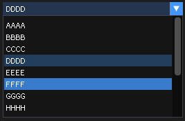
29.23.3. Bullet
- BulletText(str)
Shortcut for Bullet()+Text()
- Parameters
string – text
Example:
tImGui            =  require "ImGui"
function onLoop(delta)
    local str         = 'text'
    tImGui.BulletText(str)
end

- Bullet
Draw a small circle and keep the cursor on the same line. advance cursor x position by GetTreeNodeToLabelSpacing(), same distance that TreeNode() uses
Example:
tImGui  =  require "ImGui"
tImGui.Bullet()
29.23.4. Button
- Button(label, size)
Button
- Parameters
string – label
table – size
- Returns
boolean- result
Example:
tImGui = require "ImGui"
function onLoop(delta)
local label = 'Start'
local size = {x=0,y=0}
if tImGui.Button(label, size) then
print('Clicked')
end
end

29.23.5. Checkbox
- Checkbox(label, value)
- Parameters
string – label
boolean – value
- Returns
boolean- checked
Example:
tImGui = require "ImGui"
value = false
function onLoop(delta)
local label = 'Check me'
value = tImGui.Checkbox(label,value)
end
- CheckboxFlags(label, flags, flags_value)
- Parameters
string – label
number – flags
number – flags_value
- Returns
boolean- result,numberflags
Example:
tImGui = require "ImGui"
value = false
local flags = 0
function onLoop(delta)
local label = 'Check me'
local flags_value = 1
ret, flags = tImGui.CheckboxFlags(label, flags, flags_value)
flags_value = flags
end
29.23.6. Combo
- Combo(label, current_item, out_text), data, items_count, popup_max_height_in_items)
- Parameters
string – label might be
nilnumber – current_item
onebased!table – array of items
{'option 1', 'option 2', 'option 3',... }number – height_in_items
- Returns
boolean- result,number- current_item,string- item
Example:
tImGui = require "ImGui"
items = { "AAAA", "BBBB", "CCCC", "DDDD", "EEEE", "FFFF", "GGGG", "HHHH", "IIII", "JJJJ", "KKKK", "LLLLLLL", "MMMM", "OOOOOOO", 1,2,3,false,true,{} }
current_item_selected = 1
function onLoop(delta)
local label = 'Options'
local current_item = current_item_selected
local height_in_items = -1
local ret, current_item, item_as_string = tImGui.Combo(label, current_item, items, height_in_items)
if ret then
current_item_selected = current_item --number of item selected
end
end
29.23.7. Color
29.23.7.1. ColorPicker
- ColorPicker3(label, color, flags)
- Parameters
string – label
table – color
{r,g,b}number – flags
- Returns
boolean- result,table{r,g,b}
Example:
tImGui = require "ImGui"
color = {r=1,g=0,b=0}
function onLoop(delta)
local label = 'Pick a color'
local flags = 0
local ret, tRgb = tImGui.ColorPicker3(label, color, flags)
if ret then
color = tRgb
end
end
- ColorPicker4(label, color, flags, ref_col)
- Parameters
string – label
table – color
{r,g,b,a}number – flags
number – ref_col
{r,g,b,a}
- Returns
boolean- result,table{r,g,b,a}
Example:
tImGui = require "ImGui"
color = {r=1,g=0,b=0,a=1}
ref_color = {r=0,g=1,b=1,a=1}
function onLoop(delta)
local label = 'Pick a color'
local flags = 0
local ret, tRgba = tImGui.ColorPicker4(label, color, flags, ref_color)
if ret then
color = tRgba
end
end
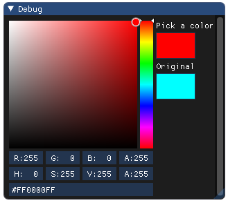
29.23.7.2. ColorButton
- ColorButton(desc_id, color, flags, size)
Display a colored square/button, hover for details, return true when pressed.
- Parameters
string – desc_id
table – color
{r,g,b,a}number – flags
table – size
{x,y}
- Returns
boolean- result
Example:
tImGui = require "ImGui"
function onLoop(delta)
local desc_id = 'id 01'
local color = {r=1,g=0,b=1,a=1}
local flags = 0
local size = {x=0,y=0}
local clicked = tImGui.ColorButton(desc_id, color, flags, size)
end
29.23.7.3. ColorEdit3
- ColorEdit3(label, color, flags)
- Parameters
string – label
table – color
{r,g,b}number – flags
- Returns
boolean- result,table-{r,g,b}
Example:
tImGui = require "ImGui"
color = {r=1,g=0,b=0}
function onLoop(delta)
local label = 'select your color'
local flags = tImGui.Flags('ImGuiColorEditFlags_HDR','ImGuiColorEditFlags_NoLabel')
-- ImGuiColorEditFlags_HDR -> Currently all this does is to lift the 0..1 limits on dragging widgets
local clicked, tRgb = tImGui.ColorEdit3(label, color, flags)
if clicked then
color = tRgb
end
end
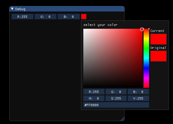
29.23.7.4. ColorEdit4
- ColorEdit4(label, color, flags)
- Parameters
string – label
number – color
{r,g,b,a}number – flags
- Returns
boolean- result,table-{r,g,b,a}
Example:
tImGui = require "ImGui"
color = {r=1,g=0,b=0,a=1}
function onLoop(delta)
local label = 'select your color'
local flags = tImGui.Flags('ImGuiColorEditFlags_NoLabel')
local clicked, tRgba = tImGui.ColorEdit4(label, color, flags)
if clicked then
color = tRgba
end
end
29.23.8. Drag
29.23.8.1. DragInt
- DragInt(label, value, v_speed, v_min, v_max, format)
If v_min >= v_max we have no bound
- Parameters
string – label
number – value
number – v_speed
number – v_min
number – v_max
string – format
- Returns
boolean- result,numbervalue
Example:
tImGui = require "ImGui"
value = 0
function onLoop(delta)
local label = 'drag int'
local v_speed = 1.0
local v_min = 0
local v_max = 0
local format = "%d seconds"
local dragged, iValue = tImGui.DragInt(label,value, v_speed, v_min, v_max, format)
if dragged then
value = iValue
end
end
- DragInt2(label, values, v_speed, v_min, v_max, format)
- Parameters
string – label
table – int values
{v1,v2}number – v_speed
number – v_min
number – v_max
string – format
- Returns
boolean- result,table-{v1,v2}
Example:
tImGui = require "ImGui"
local values = {5,255}
function onLoop(delta)
local label = 'drag int2'
local v_speed = 1.0
local v_min = 0
local v_max = 0
local format = "%d"
local dragged, tValues = tImGui.DragInt2(label,values, v_speed, v_min, v_max, format)
if dragged then
values = tValues
end
end
- DragInt3(label, values, v_speed, v_min, v_max, format)
- Parameters
string – label
table – int values
{v1,v2,v3}number – v_speed
number – v_min
number – v_max
string – format
- Returns
boolean- result,table-{v1,v2,v3}
Example:
tImGui = require "ImGui"
values = {5,255,34}
function onLoop(delta)
local label = 'drag int3'
local v_speed = 1.0
local v_min = 0
local v_max = 0
local format = "%d"
local dragged, tValues = tImGui.DragInt3(label,values, v_speed, v_min, v_max, format)
if dragged then
values = tValues
end
end
- DragInt4(label, values, v_speed, v_min, v_max, format)
- Parameters
string – label
table – int values
{v1,v2,v3,v4}number – v_speed
number – v_min
number – v_max
string – format
- Returns
boolean- result,table-{v1,v2,v3,v4}
Example:
tImGui = require "ImGui"
values = {5,255,34,99}
function onLoop(delta)
local label = 'drag int4'
local v_speed = 1.0
local v_min = 0
local v_max = 0
local format = "%d"
local dragged, tValues = tImGui.DragInt4(label,values, v_speed, v_min, v_max, format)
if dragged then
values = tValues
end
end
29.23.8.2. DragIntRange2
- DragIntRange2(label, v_current_min, v_current_max, v_speed, v_min, v_max, format, format_max)
- Parameters
string – label
number – v_current_min
number – v_current_max
number – v_speed
number – v_min
number – v_max
string – format_min
string – format_max
- Returns
boolean- result,number- dragged_min,number- dragged_max
Example:
tImGui = require "ImGui"
v_current_min = 0
v_current_max = 255
function onLoop(delta)
local label = 'Drag Int Range 2'
local v_speed = 1.0
local v_min = 0
local v_max = 255
local format_min = "%d MIN"
local format_max = "%d MAX"
local dragged, dragged_min, dragged_max = tImGui.DragIntRange2(label, v_current_min, v_current_max, v_speed, v_min, v_max, format_min, format_max)
if dragged then
v_current_min = dragged_min
v_current_max = dragged_max
end
end
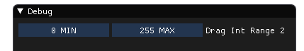
29.23.8.3. DragFloat
- DragFloat(label, value, v_speed, v_min, v_max, format, power)
If v_min >= v_max we have no bound
- Parameters
string – label
number – value
number – v_speed
number – v_min
number – v_max
string – format
number – power
- Returns
boolean- result,numbervalue
Example:
tImGui = require "ImGui"
value = 0
function onLoop(delta)
local label = 'drag float'
local v_speed = 1.0
local v_min = 0
local v_max = 1000
local format = "%.4f"
local power = 1
local dragged, fValue = tImGui.DragFloat(label,value, v_speed, v_min, v_max, format, power)
if dragged then
value = fValue
end
end
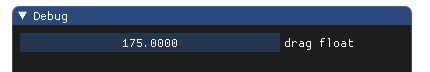
- DragFloat2(label, values, v_speed, v_min, v_max, format, power)
- Parameters
string – label
table – values
{v1,v2}number – v_speed
number – v_min
number – v_max
string – format
number – power
- Returns
boolean- result,table-{v1,v2}
Example:
tImGui = require "ImGui"
tValues = {0.0, 1000.0}
function onLoop(delta)
local label = 'drag float 2'
local v_speed = 0.5
local v_min = 0
local v_max = 1000
local format = "%.2f"
local power = 1
local dragged, fValue = tImGui.DragFloat2(label,tValues, v_speed, v_min, v_max, format, power)
if dragged then
tValues = fValue
end
end
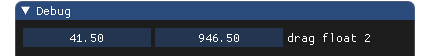
- DragFloat3(label, values, v_speed, v_min, v_max, format, power)
- Parameters
string – label
table – values
{v1,v2,v3}number – v_speed
number – v_min
number – v_max
string – format
number – power
- Returns
boolean- result,table-{v1,v2,v3}
Example:
tImGui = require "ImGui"
tValues = {0.0, 1000.0, 88.8}
function onLoop(delta)
local label = 'drag float 3'
local v_speed = 0.5
local v_min = 0
local v_max = 1000
local format = "%.2f"
local power = 1
local dragged, fValue = tImGui.DragFloat3(label,tValues, v_speed, v_min, v_max, format, power)
if dragged then
tValues = fValue
end
end
- DragFloat4(label, values, v_speed, v_min, v_max, format, power)
- Parameters
string – label
table – values
{v1,v2,v3,v4}number – v_speed
number – v_min
number – v_max
string – format
number – power
- Returns
boolean- result,table-{v1,v2,v3,v4}
Example:
tImGui = require "ImGui"
tValues = {0.0, 1000.0, 88.8, 66.65}
function onLoop(delta)
local label = 'drag float 4'
local v_speed = 0.5
local v_min = 0
local v_max = 1000
local format = "%.2f"
local power = 1
local dragged, fValue = tImGui.DragFloat3(label,tValues, v_speed, v_min, v_max, format, power)
if dragged then
tValues = fValue
end
end
29.23.8.4. DragFloatRange2
- DragFloatRange2(label, v_current_min, v_current_max, v_speed, v_min, v_max, format_min, format_max, power)
- Parameters
string – label
number – v_current_min
number – v_current_max
number – v_speed
number – v_min
number – v_max
string – format_min
string – format_max
number – power
- Returns
boolean- result,number- dragged_min,number- dragged_max
Example:
tImGui = require "ImGui"
v_current_min = 0.0
v_current_max = 1000.0
function onLoop(delta)
local label = 'Drag float Range 2'
local v_speed = 0.5
local v_min = 0
local v_max = 1000.0
local format_min = "%.1f MIN"
local format_max = "%.1f MAX"
local power = 1.0
local dragged, dragged_min, dragged_max = tImGui.DragFloatRange2(label, v_current_min, v_current_max, v_speed, v_min, v_max, format_min, format_max)
if dragged then
v_current_min = dragged_min
v_current_max = dragged_max
end
end
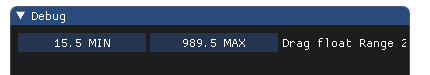
29.23.9. HelpMarker
- HelpMarker(text, string * mark)
Helper to display a little (?) mark which shows a tooltip when hovered.
- Parameters
string – text
string – mark (default is
(?))
Example:
tImGui = require "ImGui"
function onLoop(delta)
local text = 'Those flags are set by the back-ends (imgui_impl_xxx files) bla bla bla...'
tImGui.HelpMarker(text)
end
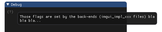
29.23.10. Image
- Image(texture_file_name, size, uv0, uv1, bg_col, line_color)
- Parameters
string – texture file name or
number( id of texture )table – size
{x,y}(passnilto get the default size)table – uv0
{x,y}(default size is 0,0)table – uv1
{x,y}(default size is 1,1)table – bg_col
{x,y,z,w}or{r,g,b,a}(default size is 1,1,1,1)table – line_color
{x,y,z,w}or{r,g,b,a}(default size is 0,0,0,1)
Example:
tImGui = require "ImGui"
function onLoop(delta)
local texture_name = 'HB_smile.png'
local size = {x=50,y=50}
local uv0 = {x=0,y=0}
local uv1 = {x=1,y=1}
local bg_col = {r=1,g=1,b=1,a=1}
local line_color = {r=1,g=1,b=1,a=1} -- white color
tImGui.Image(texture_name, size,uv0,uv1,bg_col,line_color)
end

29.23.11. ImageQuad
- ImageQuad(texture_file_name, size, uv0, uv1, bg_col, line_color)
- Parameters
string – texture file name or
number( id of texture )table – size
{x,y}(passnilto get the default size)table – uv0
{x,y}table – uv1
{x,y}table – uv2
{x,y}table – uv3
{x,y}table – bg_col
{x,y,z,w}or{r,g,b,a}(default size is 1,1,1,1)table – line_color
{x,y,z,w}or{r,g,b,a}(default size is 0,0,0,1)
Example:
tImGui = require "ImGui"
function onLoop(delta)
local texture_name = 'HB_smile.png'
local size = {x=50,y=50}
local uv1 = {x = 0, y = 0}
local uv2 = {x = 1, y = 0}
local uv3 = {x = 1, y = 1}
local uv4 = {x = 0, y = 1}
local bg_col = {r=1,g=1,b=1,a=1}
local line_color = {r=1,g=1,b=1,a=1} -- white color
tImGui.ImageQuad(texture_name, size,uv1, uv2, uv3, uv4, bg_col, line_color)
end
29.23.12. ImageButton
- ImageButton(texture_file_name, size, uv0, uv1, bg_col, line_color)
- Parameters
string – texture file name or
number( id of texture )table – size
{x,y}(passnilto get the default size)table – uv0
{x,y}(default size is 0,0)table – uv1
{x,y}(default size is 1,1)number – frame_padding <0 use default frame padding settings. 0 for no padding.
table – bg_col
{x,y,z,w}or{r,g,b,a}(default size is 1,1,1,1)table – tint_color
{x,y,z,w}or{r,g,b,a}(default size is 1,1,1,1)
Example:
tImGui = require "ImGui"
function onLoop(delta)
local texture = 'HB_smile.png'
local size = {x=100,y=100}
local uv0 = {x=0,y=0}
local uv1 = {x=1,y=1}
local frame_padding = -1
local bg_col = {r=0,g=0,b=0,a=0}
local tint_color = {r=1,g=1,b=1,a=1}
if tImGui.ImageButton(texture, size,uv0,uv1,frame_padding,bg_col,tint_color) then
print('Button image pressed')
end
end
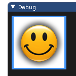
29.23.13. Input
29.23.13.1. InputInt
- InputInt(label, value, step, step_fast, flags)
- Parameters
string – label
number – value
number – step
number – step_fast
number – flags
- Returns
boolean- result,numbervalue
Example:
tImGui = require "ImGui"
value = 0
function onLoop(delta)
local label = 'input int'
local step = 1
local step_fast = 100
local flags = 0
local result, iValue = tImGui.InputInt(label, value, step, step_fast, flags)
if result then
value = iValue
end
end
29.23.13.2. InputInt2
- InputInt2(label, values, flags)
- Parameters
string – label
table – values
{v1,v2}number – flags
- Returns
boolean- result,tablevalues
Example:
tImGui = require "ImGui"
values = {10,5}
function onLoop(delta)
local label = 'InputInt2'
local flags = 0
local result, iValues = tImGui.InputInt2(label, values, flags)
if result then
values = iValues
end
end
29.23.13.3. InputInt3
- InputInt3(label, values, flags)
- Parameters
string – label
table – values
{v1,v2,v3}number – flags
- Returns
boolean- result,tablevalues
Example:
tImGui = require "ImGui"
values = {10,5,25}
function onLoop(delta)
local label = 'InputInt3'
local flags = 0
local result, iValues = tImGui.InputInt3(label, values, flags)
if result then
values = iValues
end
end
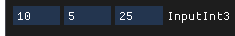
29.23.13.4. InputInt4
- InputInt4(label, values, flags)
- Parameters
string – label
table – values
{v1,v2,v3,v4}number – flags
- Returns
boolean- result,tablevalues
Example:
tImGui = require "ImGui"
values = {10,-5,25,-99}
function onLoop(delta)
local label = 'InputInt4'
local flags = 0
local result, iValues = tImGui.InputInt4(label, values, flags)
if result then
values = iValues
end
end
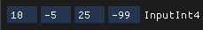
29.23.13.5. InputFloat
- InputFloat(label, value, step, step_fast, format, flags)
- Parameters
string – label
number – value
number – step
number – step_fast
string – format
number – flags
- Returns
boolean- result,numbervalue
Example:
tImGui = require "ImGui"
value = 50.0
function onLoop(delta)
local label = 'input float'
local step = 1.0
local step_fast = 100.0
local format = "%.2f"
local flags = 0
local result, fValue = tImGui.InputFloat(label, value, step, step_fast, format, flags)
if result then
value = fValue
end
end
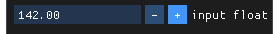
29.23.13.6. InputFloat2
- InputFloat2(label, values, format, flags)
- Parameters
string – label
table – values
{v1,v2}string – format
number – flags
- Returns
boolean- result,tablevalues
Example:
tImGui = require "ImGui"
values = {10,5}
function onLoop(delta)
local label = 'InputFloat2'
local format = '%.2f'
local flags = 0
local result, fValues = tImGui.InputFloat2(label, values, format, flags)
if result then
values = fValues
end
end
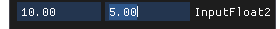
29.23.13.7. InputFloat3
- InputFloat3(label, values, format, flags)
- Parameters
string – label
table – values
{v1,v2,v3}string – format
number – flags
- Returns
boolean- result,tablevalues
Example:
tImGui = require "ImGui"
values = {10,5,88}
function onLoop(delta)
local label = 'InputFloat3'
local format = '%.2f'
local flags = 0
local result, fValues = tImGui.InputFloat3(label, values, format, flags)
if result then
values = fValues
end
end
29.23.13.8. InputFloat4
- InputFloat4(label, values, format, flags)
- Parameters
string – label
table – values
{v1,v2,v3,v4}string – format
number – flags
- Returns
boolean- result,tablevalues
Example:
tImGui = require "ImGui"
values = {10,5,-78.5,99.95}
function onLoop(delta)
local label = 'InputFloat4'
local format = '%.2f'
local flags = 0
local result, fValues = tImGui.InputFloat4(label, values, format, flags)
if result then
values = fValues
end
end
29.23.13.9. InputDouble
- InputDouble(label, value, step, step_fast, format, flags)
- Parameters
string – label
number – value
number – step
number – step_fast
string – format
number – flags
- Returns
boolean- result,numbervalue
Example:
tImGui = require "ImGui"
value = math.pi
function onLoop(delta)
local label = 'input double'
local step = 0.0001
local step_fast = 1.0
local format = "%.9f"
local flags = 0
local result, fValue = tImGui.InputDouble(label, value, step, step_fast, format, flags)
if result then
value = fValue
end
end
29.23.13.10. InputText
- InputText(label, text, flags)
- Parameters
string – label
string – text
number – flags
- Returns
boolean- modified,string- new_text
Example:
tImGui = require "ImGui"
text = 'text'
function onLoop(delta)
local label = 'Label'
local flags = 0
local modified , sNewText = tImGui.InputText(label,text,flags)
if modified then
text = sNewText
end
end
29.23.13.11. InputTextWithHint
- InputTextWithHint(label, hint, text, flags)
- Parameters
string – label
string – hint
string – text
number – flags
- Returns
boolean- modified,string- new_text
Example:
tImGui = require "ImGui"
text = 'text'
function onLoop(delta)
local label = 'Label'
local hint = '<name>'
local flags = 0
local modified , sNewText = tImGui.InputTextWithHint(label,text,hint,flags)
if modified then
text = sNewText
end
end
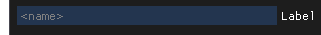
29.23.13.12. InputTextMultiline
- InputTextMultiline(label, text, size, flags)
- Parameters
string – label
string – text
table – size
{x,y}number – flags
- Returns
boolean- modified,string- new_text
Example:
tImGui = require "ImGui"
text = 'line 1\nline 2\nline 3\n...'
function onLoop(delta)
local label = 'Label'
local size = {x=100,y=100}
local flags = 0
local modified , sNewText = tImGui.InputTextMultiline(label,text,size,flags)
if modified then
text = sNewText
end
end
29.23.14. LabelText
- LabelText(label, text)
Display text+label aligned the same way as value+label widgets
- Parameters
string – label
string – text
Example:
tImGui = require "ImGui"
function onLoop(delta)
local label = 'Label'
local text = 'text'
tImGui.LabelText(label, text)
end
29.23.15. ListBox
- ListBox(label, current_item, items, height_in_items)
- Parameters
string – label
number – current_item
table – array of items
{'item 1', 'item 2', 'item 3',... }number – height_in_items
- Returns
boolean- result,number- current_item,string- item
Example:
tImGui = require "ImGui"
current_item = 1
function onLoop(delta)
local label = "listbox\n(single select)"
local items = {1,2,3,true,false,"Apple", "Banana", "Cherry", "Kiwi", "Mango", "Orange", "Pineapple", "Strawberry", "Watermelon"}
local height_in_items = -1
local ret, iItem, item = tImGui.ListBox(label, current_item,items, height_in_items)
if ret then
print(item)
current_item = iItem
end
end
29.23.15.1. BeginListBox
- BeginListBox(label, size)
Use if you want to re-implement ListBox() with custom data or interactions. Renamed from ListBoxHeader in ImGui. If the function returns true, output elements then call EndListBox() afterwards.
- Parameters
string – label
table – size
{x,y}(default:{x=0,y=0})
- Returns
boolean- result
Example:
tImGui = require "ImGui"
local label = 'label'
local size_arg = {x=200,y=70}
if tImGui.BeginListBox(label, size_arg) then
-- output Selectable items here
tImGui.EndListBox()
end
- EndListBox
Terminate the scrolling region. Only call EndListBox() if BeginListBox() returned true!
29.23.16. Menu
29.23.16.3. MenuItem
- MenuItem(label, shortcut, selected, enabled)
Return true when clicked and
booleanchecked. shortcuts are displayed for convenience but not processed by ImGui at the moment- Parameters
string – label
string – shortcut (Might be
nil)boolean – selected
boolean – enabled
- Returns
boolean- clicked,boolean- checked
Example:
tImGui = require "ImGui"
selected = true
function onLoop(delta)
local label = 'menu label'
local shortcut = 'F6'
local enabled = true
local clicked,checked = tImGui.MenuItem(label, shortcut, selected, enabled)
if clicked then
selected = checked
end
end
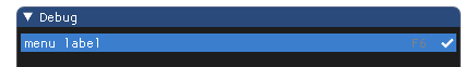
29.23.17. NewLine
- NewLine
Undo a SameLine() or force a new line when in an horizontal-layout context.
Example:
tImGui = require "ImGui"
tImGui.NewLine()
29.23.18. PlotLines
- PlotLines(label, values, values_offset, overlay_text, scale_min, scale_max, graph_size)
- Parameters
string – label
number – values
{v1,v2,v3,v4,...}number – values_offset
string – overlay_text
number – scale_min
number – scale_max
number – graph_size
{x,y}
Example:
tImGui = require "ImGui"
function onLoop(delta)
local label = "Lines"
local values = { 0.6, 0.1, 1.0, 0.5, 0.92, 0.1, 0.2 }
local values_offset = 0
local overlay_text = 'Result' -- might be nil
local scale_min = 0.1
local scale_max = 1.0
local graph_size = {x=200,y=70}
tImGui.PlotLines(label, values, values_offset, overlay_text, scale_min, scale_max, graph_size)
end
29.23.19. PlotHistogram
- PlotHistogram(label, values, values_offset, overlay_text, scale_min, scale_max, graph_size)
- Parameters
string – label
number – values
{v1,v2,v3,v4,...}number – values_offset
string – overlay_text
number – scale_min
number – scale_max
number – graph_size
{x,y}
Example:
tImGui = require "ImGui"
function onLoop(delta)
local label = ""
local values = { 0.6, 0.1, 1.0, 0.5, 0.92, 0.1, 0.2 }
local values_offset = 0
local overlay_text = 'Fancy Histogram' -- might be nil
local scale_min = 0.1
local scale_max = 1.0
local graph_size = {x=300,y=150}
tImGui.PlotHistogram(label, values, values_offset, overlay_text, scale_min, scale_max, graph_size)
end
29.23.20. ProgressBar
- ProgressBar(progress, size_arg, overlay)
- Parameters
number – progress
table – size_arg
string – overlay
Example:
tImGui = require "ImGui"
local estimated = 2
local current = 0
function onLoop(delta)
current = current + delta
if current >= estimated then
current = 0
end
local progress = current / estimated
local size_arg = {x = -1, y = 0}
local overlay = string.format('Loading %d',progress * 100)
tImGui.ProgressBar(progress, size_arg, overlay)
end

29.23.21. RadioButton
- RadioButton(label, active)
- Parameters
string – label
number – index_activated Radio-button which is activated.
number – my_index .
- Returns
number- index of activated radio-button
Example:
tImGui = require "ImGui"
index_activated = 2
function onLoop(delta)
index_activated = tImGui.RadioButton('Option 1', index_activated, 1)
index_activated = tImGui.RadioButton('Option 2', index_activated, 2)
index_activated = tImGui.RadioButton('Option 3', index_activated, 3)
end
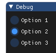
29.23.22. Selectable
- Selectable(label, selected, flags, size)
“bool selected” carry the selection state (read-only). Selectable() is clicked is returns true so you can modify your selection state. size.x==0.0: use remaining width, size.x>0.0: specify width. size.y==0.0: use label height, size.y>0.0: specify height
- Parameters
string – label
boolean – selected
number – flags
table – size
- Returns
boolean- result,booleanselected
Example:
tImGui = require "ImGui"
local label = 'label'
local selected = false
local flags = 0
local size = {x=0,y=0}
local result, selected = tImGui.Selectable(label, selected, flags, size)
29.23.23. SmallButton
- SmallButton(label)
Button with FramePadding=(0,0) to easily embed within text
- Parameters
string – label
- Returns
boolean- result
Example:
tImGui = require "ImGui"
function onLoop(delta)
local label = 'Start'
tImGui.SmallButton(label)
end

29.23.24. Slider
29.23.24.1. SliderInt
- SliderInt(label, value, v_min, v_max, format)
- Parameters
string – label
number – value
number – v_min
number – v_max
string – format
- Returns
boolean- result,numbervalue
Example:
tImGui = require "ImGui"
value = 0
function onLoop(delta)
local label = 'SliderInt'
local v_min = 0
local v_max = 100
local format = "%d"
local result, iValue = tImGui.SliderInt(label, value, v_min, v_max, format)
if result then
value = iValue
end
end
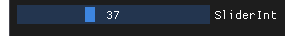
29.23.24.2. SliderInt2
- SliderInt2(label, values, v_min, v_max, format)
- Parameters
string – label
table – values
{v1,v2}number – v_min
number – v_max
string – format
- Returns
boolean- result,tablevalues
Example:
tImGui = require "ImGui"
tValue = {0,0}
function onLoop(delta)
local label = 'SliderInt2'
local v_min = 0
local v_max = 100
local format = "%d"
local result, iValues = tImGui.SliderInt2(label, tValue, v_min, v_max, format)
if result then
tValue = iValues
end
end
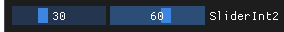
29.23.24.3. SliderInt3
- SliderInt3(label, values, v_min, v_max, format)
- Parameters
string – label
table – values
{v1,v2,v3}number – v_min
number – v_max
string – format
- Returns
boolean- result,tablevalues
Example:
tImGui = require "ImGui"
tValue = {0,0,0}
function onLoop(delta)
local label = 'SliderInt3'
local v_min = 0
local v_max = 100
local format = "%d"
local result, iValues = tImGui.SliderInt3(label, tValue, v_min, v_max, format)
if result then
tValue = iValues
end
end

29.23.24.4. SliderInt4
- SliderInt4(label, values, v_min, v_max, format)
- Parameters
string – label
table – values
{v1,v2,v3,v4}number – v_min
number – v_max
string – format
- Returns
boolean- result,tablevalues
Example:
tImGui = require "ImGui"
tValue = {0,0,0,0}
function onLoop(delta)
local label = 'SliderInt4'
local v_min = 0
local v_max = 100
local format = "%d"
local result, iValues = tImGui.SliderInt4(label, tValue, v_min, v_max, format)
if result then
tValue = iValues
end
end

29.23.24.5. SliderFloat
- SliderFloat(label, value, v_min, v_max, format, power)
Adjust format to decorate the value with a prefix or a suffix for in-slider labels or unit display. Use power!=1.0 for power curve sliders
- Parameters
string – label
number – value
number – v_min
number – v_max
string – format
number – power
- Returns
boolean- result,numbervalue
Example:
tImGui = require "ImGui"
value = 0
function onLoop(delta)
local label = 'SliderFloat'
local v_min = 0
local v_max = 100
local format = "%.3f"
local power = 1.0
local result, fValue = tImGui.SliderFloat(label, value, v_min, v_max, format,power)
if result then
value = fValue
end
end
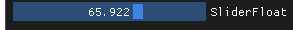
29.23.24.6. SliderFloat2
- SliderFloat2(label, values, v_min, v_max, format, power)
- Parameters
string – label
table – values
{v1,v2}number – v_min
number – v_max
string – format
number – power
- Returns
boolean- result,tablevalues
Example:
tImGui = require "ImGui"
tValue = {0.0, 0.0}
function onLoop(delta)
local label = 'SliderFloat2'
local v_min = 0
local v_max = 100
local format = "%.3f"
local power = 1.0
local result, fValues = tImGui.SliderFloat2(label, tValue, v_min, v_max, format, power)
if result then
tValue = fValues
end
end

29.23.24.7. SliderFloat3
- SliderFloat3(label, values, v_min, v_max, format, power)
- Parameters
string – label
table – values
{v1,v2,v3}number – v_min
number – v_max
string – format
number – power
- Returns
boolean- result,tablevalues
Example:
tImGui = require "ImGui"
tValue = {0.0, 0.0, 0.0}
function onLoop(delta)
local label = 'SliderFloat3'
local v_min = 0
local v_max = 100
local format = "%.3f"
local power = 1.0
local result, fValues = tImGui.SliderFloat3(label, tValue, v_min, v_max, format, power)
if result then
tValue = fValues
end
end

29.23.24.8. SliderFloat4
- SliderFloat4(label, values, v_min, v_max, format, power)
- Parameters
string – label
table – values
{v1,v2,v3,v4}number – v_min
number – v_max
string – format
number – power
- Returns
boolean- result,tablevalues
Example:
tImGui = require "ImGui"
tValue = {0.0, 0.0, 0.0, 0.0}
function onLoop(delta)
local label = 'SliderFloat4'
local v_min = 0
local v_max = 100
local format = "%.1f"
local power = 1.0
local result, fValues = tImGui.SliderFloat4(label, tValue, v_min, v_max, format, power)
if result then
tValue = fValues
end
end

29.23.24.9. SliderAngle
Display angle in degree from radian value. The returned value is in radian.
- SliderAngle(label, value_in_radian, v_degrees_min, v_degrees_max, format)
- Parameters
string – label
number – value_in_radian
number – v_degrees_min
number – v_degrees_max
string – format
- Returns
boolean- result,numberradian
Example:
tImGui = require "ImGui"
radian = math.rad(90)
function onLoop(delta)
local label = 'SliderAngle'
local a_min = 0
local a_max = 180
local format = "%.1f"
local result, fRadian = tImGui.SliderAngle(label, radian, a_min, a_max, format)
if result then
radian = fRadian
end
end

29.23.25. TreeNode
29.23.25.1. TreeNode
- TreeNode(label)
- Parameters
string – label
- Returns
boolean- result
Example:
tImGui = require "ImGui"
function onLoop(delta)
if tImGui.TreeNode("this is a tree node") then
if tImGui.TreeNode("another one of those tree node...") then
tImGui.Text("Some tree contents")
tImGui.TreePop()
end
tImGui.TreePop()
end
end
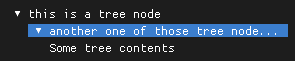
29.23.25.2. TreeNode
- TreeNode(str_id, label)
- param string
str_id (might be
nil)- param string
label
- return
boolean- result
Example:
tImGui = require "ImGui"
function onLoop(delta)
if tImGui.TreeNode('id_0',"this is a tree node") then
if tImGui.TreeNode('id_1',"another one of those tree node...") then
tImGui.Text("Some tree contents")
tImGui.TreePop()
end
tImGui.TreePop()
end
end
29.23.25.3. TreeNodeEx
- TreeNodeEx(label, flags, str_id*)
- Parameters
string – label
number – flags
string – str_id (might be omitted)
- Returns
boolean- result
Example:
tImGui = require "ImGui"
function onLoop(delta)
local flags = 0
if tImGui.TreeNodeEx("this is a tree node Ex",flags) then
if tImGui.TreeNodeEx("another one of those tree node Ex...",flags) then
tImGui.Text("Some tree contents")
tImGui.TreePop()
end
tImGui.TreePop()
end
end
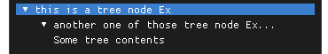
29.23.25.4. TreePush
- TreePush(str_id)
~Indent()+PushId(). Already called by TreeNode() when returning true, but you can call TreePush/TreePop yourself if desired.
- Parameters
string – str_id (might be
nil)
Example:
tImGui = require "ImGui"
local str_id = '01'
tImGui.TreePush(str_id)
29.23.25.5. TreePop
- TreePop
~Unindent()+PopId()
Example:
tImGui = require "ImGui"
tImGui.TreePop()
29.23.25.6. TreeAdvanceToLabelPos
- TreeAdvanceToLabelPos
Example:
tImGui = require "ImGui"
function onLoop(delta)
tImGui.TreeAdvanceToLabelPos()
if tImGui.TreeNode("this is a tree node") then
if tImGui.TreeNode("another one of those tree node...") then
tImGui.Text("Some tree contents")
tImGui.TreePop()
end
tImGui.TreePop()
end
end
29.23.25.7. CollapsingHeader
- CollapsingHeader(label, p_open, flags)
When ‘p_open’ isn’t
false, display an additional small close button on upper right of the header- Parameters
string – label
boolean – p_open
number – flags
- Returns
boolean- result,boolean- p_open
Example:
tImGui = require "ImGui"
local label = 'my label'
local p_open = true
local flags = 0
local ret, p_open = tImGui.CollapsingHeader(label, p_open, flags)
29.23.25.8. GetTreeNodeToLabelSpacing
- GetTreeNodeToLabelSpacing
Horizontal distance preceding label when using TreeNode * () or Bullet() == (g.FontSize + style.FramePadding.x * 2) for a regular unframed TreeNode
- Returns
number- value
Example:
tImGui = require "ImGui"
tImGui.GetTreeNodeToLabelSpacing()
29.23.25.9. SetNextItemOpen
- SetNextItemOpen(is_open, cond)
Set next TreeNode/CollapsingHeader open state.
- Parameters
boolean – is_open
number – cond
Example:
tImGui = require "ImGui"
local is_open = true
local cond = 0
tImGui.SetNextItemOpen(is_open, cond)
29.23.26. VSlider
29.23.26.1. VSliderInt
- VSliderInt(label, size, value, v_min, v_max, format)
- Parameters
string – label
table – size
{x,y}number – value
number – v_min
number – v_max
string – format
- Returns
boolean- result,numbervalue
Example:
tImGui = require "ImGui"
value = 0
function onLoop(delta)
local label = 'VSliderInt'
local size = {x=20,y=100}
local v_min = 0
local v_max = 5
local format = "%d"
local result, iValue = tImGui.VSliderInt(label, size, value, v_min, v_max, format)
if result then
value = iValue
end
end
29.23.26.2. VSliderFloat
- VSliderFloat(label, size, value, v_min, v_max, format, power)
- Parameters
string – label
table – size
{x,y}number – value
number – v_min
number – v_max
string – format
number – power
- Returns
boolean- result,numbervalue
Example:
tImGui = require "ImGui"
value = 0
function onLoop(delta)
local label = 'VSliderFloat'
local size = {x=30,y=100}
local v_min = 0
local v_max = 100
local format = "%.1f"
local power = 1.0
local result, iValue = tImGui.VSliderFloat(label, size, value, v_min, v_max, format,power)
if result then
value = iValue
end
end